Published on
Ivar Sakk is a designer and design historian based in Tallinn. He has been teaching at the Estonian Academy of Arts since 2003 and worked as head and professor in the Graphic Design Department (2005–2015). In 2012, Sakk defended his doctoral thesis titled From Aa to Zz at the Estonian Academy of Arts on the history of typography. For this work, he received the bronze medal at the Best Book Design from all over the World competition for 2013.
Grete Tiigiste is an architectural historian, curator and head of exhibitions at the Estonian Museum of Architecture. Her research focuses on Estonian architecture and interior architecture of the 1970s and 1980s, and she has curated exhibitions and published articles on this topic.
Andree Paat is a type designer. He graduated from the Graphic Design Department at the Estonian Academy of Arts in 2016. After his studies, he did an internship in 2017 at the Commercial Type design studio in New York. Since 2018, Paat has collaborated with the Berlin-based type design studio Dinamo on various typeface projects. He works under the name Kirjatehnika and since 2018 he has been a visiting lecturer in the Graphic Design Department at the Estonian Academy of Arts. Together with Aimur Takk, he has run the type design studio Tüpokompanii since 2022.
Aimur Takk is a freelance designer, working across different fields, focusing mainly on type design and visual identities. He graduated from the Graphic Design Department at the Estonian Academy of Arts in 2016 and studied type design at HfG Offenbach (2015–2016) and ÉCAL (2018–2020). Takk has created typefaces for events such as the ERKI Fashion Show (2017), Tallinn Music Week and Radio IDA. He has been a visiting lecturer at the Graphic Design Department at the Estonian Academy of Arts since 2017 and is one of the organisers of the ??? type design summer school. Since 2022, together with Andree Paat he has run the type design studio Tüpokompanii.
The Olympic Games are a grand sports event, bringing together most of the world’s countries. In scale, it is a unique event – no cultural festival, scientific conference, environmental or business event has ever reached a similar level in terms of visitor numbers or social response. And even though it seems that today, the impact of the Olympic movement is decreasing, nothing could replace it.
In addition to sports, the games involve numerous other fields – architecture and construction, urban planning, information technology, cultural management, transport and logistics. Design also has its place, starting from the design of sports equipment and clothing and ending with environmental design and visual communication. In fact, this phenomenon could be described as a kind of ‘design Olympics’, where designers compete to see who can solve environmental, product or graphic design tasks in the most functional and innovative way. In this article, we will take a closer look at the links between typography and the Olympic Games, focusing on the design of the typeface used for the Tallinn Sailing Regatta held as part of the 1980 Moscow Olympics, as well as its legacy today.
Use of typefaces during previous Olympic Games
Before the digital revolution, creating a custom typeface for an event was a technological and economical challenge. This is why mostly existing corporate typefaces were used, these were also more easily reproducible as phototypesetting became more accessible. For the 1972 Munich Summer Olympics, the typeface Univers was selected; for the 1980 Moscow games, Futura; for the 2002 Salt Lake City, Myriad. A new era was ushered in through computer programs that enabled digital typefaces and the practice of creating corporate fonts became commonplace. The most comprehensive typeface usage program to date was implemented at the most recent Games in Paris in 2024. The font, created for the Paris Olympics was used everywhere – on signage, posters, athletes’ uniforms, banners, printed materials, television and stadium screens and more, created by the French designers Elliott Amblard and Julie Soudanne. Its character was meant to evoke the 8th Olympics that had taken place in Paris a hundred years earlier. However, in Amblard and Soudanne’s design, the Art Déco-like forms remained in the background and the font was more similar to the decorative typefaces of the 1970s, such as Marwin and Busorama.
Coming back to 1980, it is worth mentioning that during the preparation for the Tallinn Olympic Regatta, urban design, including information graphics, small forms, and street furniture were also extensively considered. To execute this task of urban design, a new working group, Urban Design Group, was formed, led by designer Matti Õunapuu. The group also included designers Taimi Soo, Tiit Jürna, Silver Vahtre, architect Ago Pähn, while the engineer Jaan Port and designer Jaak Aavik and Peeter Parker joined later in the process. The brief prepared by the designers themselves clearly envisioned that one of the foundations of comprehensive urban design is a typeface. In essence, this was the first time a custom typeface intended for extensive use was designed in Estonia.
Inventing production technology for signage
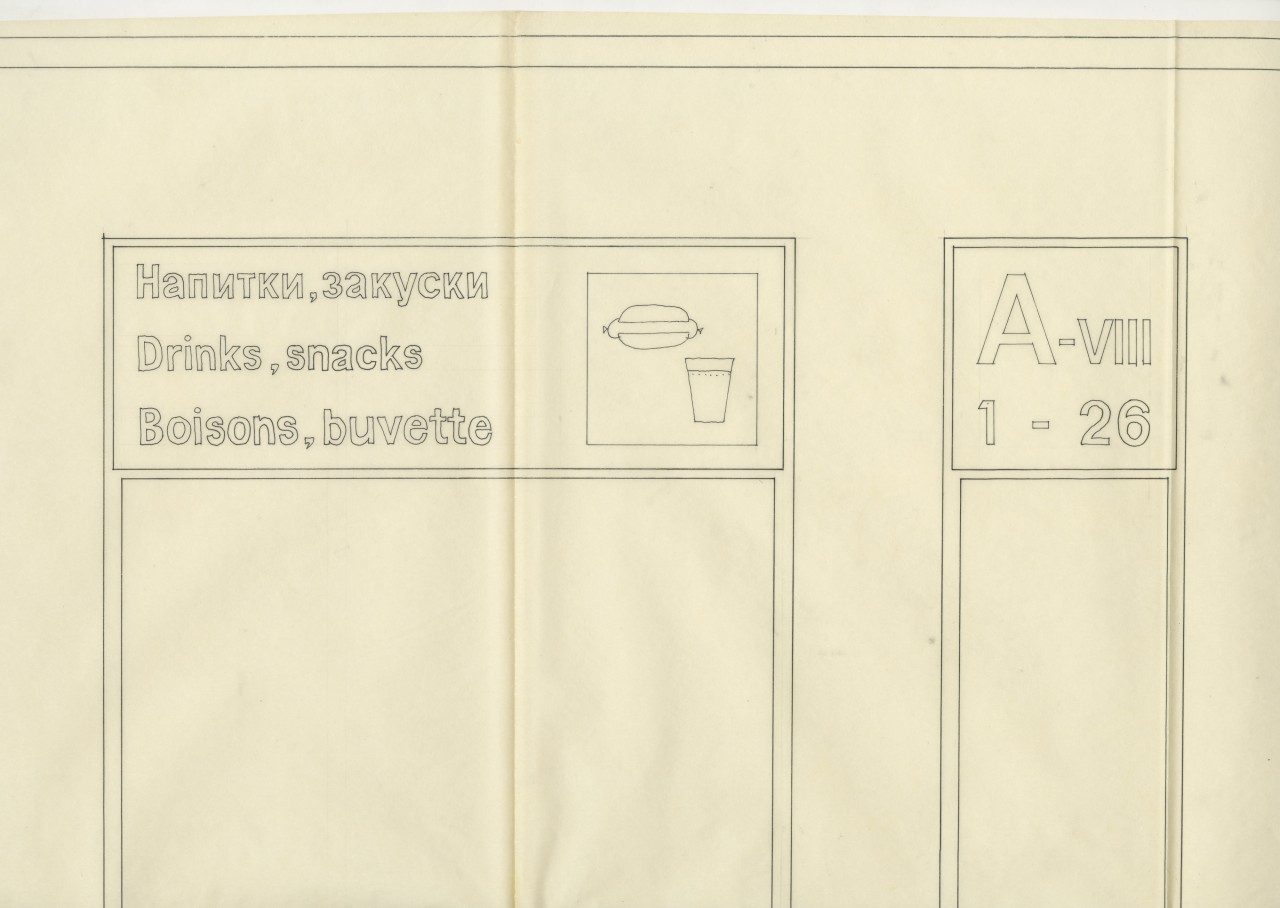
The creation of the Urban Design Group’s typeface was prefaced by solving a design problem – the most important architectural site of the 1980 Regatta, the Pirita Yachting Centre, needed a wide range of signage, floor plans, door plates, hotel room numbers and other communication elements that needed to look uniform. However, there was no suitable production technology available in the Soviet Union – at the time, door plates, information signage and materials were written by hand. In the local Art Factory ARS, there was a whole army of calligraphers, producing hand-drawn letters using round and broad-nib pens with ink and gouache. For shorter signs or names, stencil printing, enamel signs and rows of letters cut from foam plastic using a hot wire and glued in place, were also used.
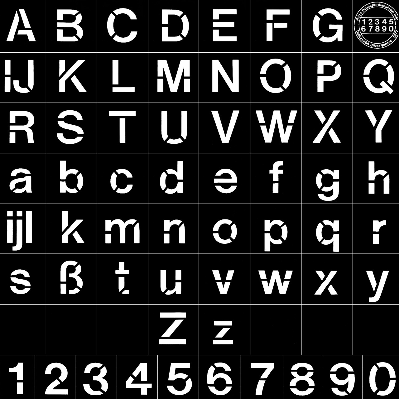
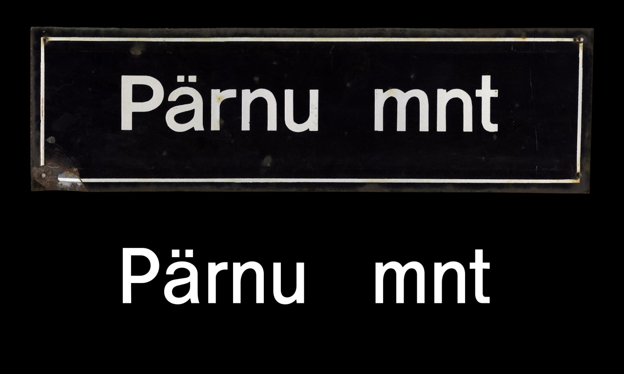
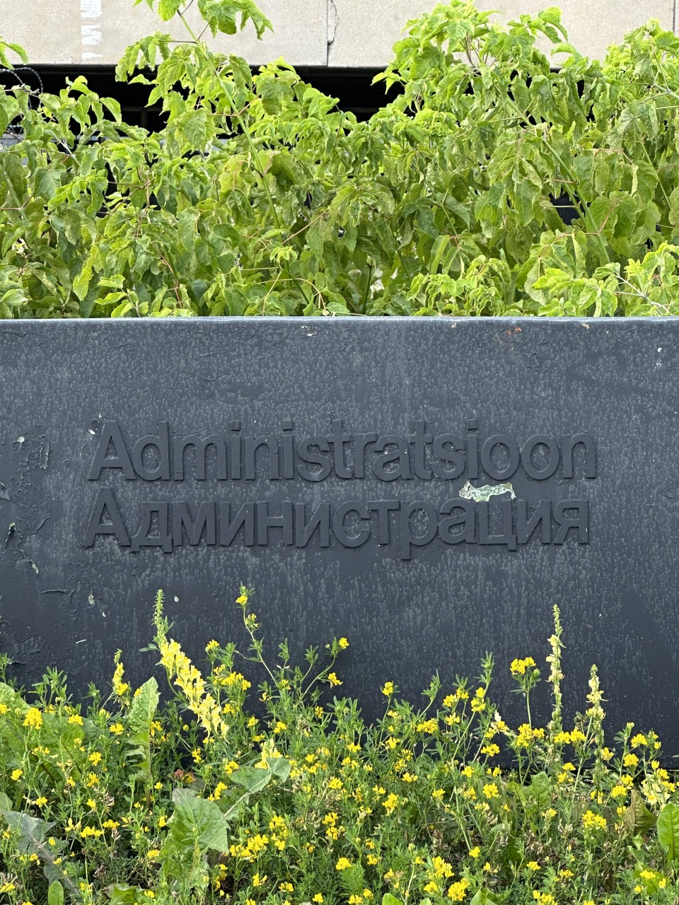
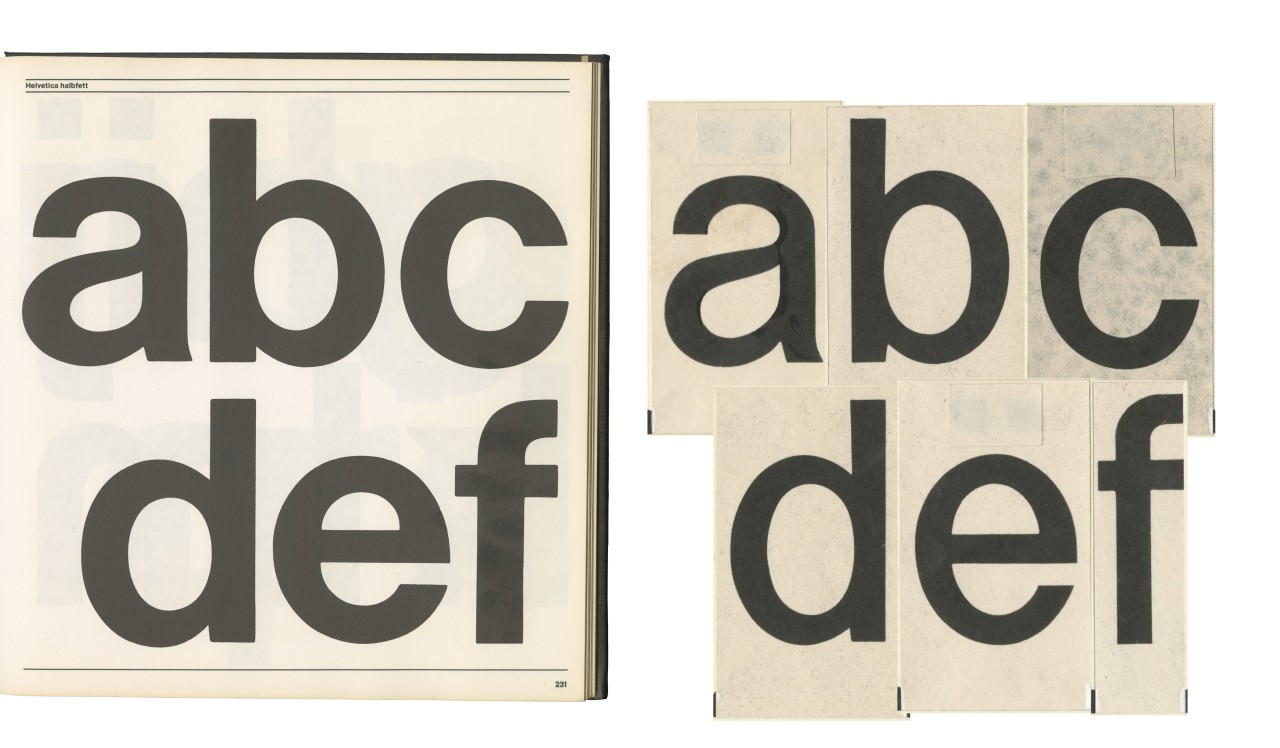
According to Matti Õunapuu, it was clear from early on that these methods of handcrafting would not be able to solve the signage task at hand – the centre needed more than 1,000 door plates and 600 signs both for indoor and outdoor spaces. To produce these, the Urban Design Group invented a new technology – using metal letter cliche plates to hot-press text onto plastic. To have uniform letters and numbers, the designer Tiit Jürna drew up a new typeface for the Olympic centre. He modelled it after the favourite typeface of the 20th century Modernists, Helvetica, which he managed to study and photograph from a Western letter catalogue, most likely 270 Schriften. By the end of the 1970s, the available Helvetica cuts included: ultra light, light, light condensed, medium, medium condensed, bold and bold extended. Looking back, Jürna has said that none of these cuts suited the preferences of the Urban Design Group, which is why he decided to design his own version of the popular typeface, using the material he had found. Jürna chose Helvetica Medium as his starting point, made the overall design lighter and carefully condensed the letter forms. Helvetica Condensed did already exist but Jürna did not like it due to its mechanical form. In addition, Jürna had to draw a Cyrillic version, as such a typeface was not available at the time due to the Iron Curtain and the weakness of the Soviet currency. The typeface was named Tallinna Infošrift, as it was intended from the very beginning to last in the Tallinn urban space for longer than just the summer of the Olympic Games.
But why was another typeface used for the Olympic Regatta, why did they not adopt the official Moscow Olympics typeface, Futura, which had been chosen in Soviet Russia? The issues the Estonian designers had with it when choosing the font for the Sailing Regatta did not stem from the corporate identity of the Summer Olympics or aesthetic choices, instead, the reasons were more prosaic – the poverty, technological backwardness and isolation of the communist empire. One of the issues was also that of continuity, as the Baltic Regatta competition held in Tallinn in 1979 was a testing ground for the Urban Design Group both in terms of designing major Tallinn landmarks like the Pirita Yachting Centre and the Tallinn Linnahall (Tallinn City Hall), as well as in producing informational materials. There was a desire for the 1980 Olympic Sailing Regatta to carry a similar identity. Besides that, neither the Russian designers nor the games organisers offered any technological solutions for using the Futura typeface, so it didn’t really matter much which font was chosen. To bring Tallinna Infošrift into the urban space, the designer Silver Vahtre designed a stencil typeface for the 1979 Baltic Regatta, meant specifically to mark larger outdoor objects, as at the time, stencils were among the few technological options for applying a typeface properly in the urban environment. In addition to the Regatta designs, the same method was used to produce street signs and house numbers in Tallinn and in these, Tallinna Infošrift lived a long life years afterwards.
A typeface reborn
Over the years, Tallinn’s urban space has changed significantly, bit by bit, street signs have been replaced and consequently also Tiit Jürna’s typeface. Here and there, it is still around in the interiors of the Pirita Yachting Centre and Linnahall but these buildings are currently in slow decline. And so, the fact that the typeface was created in preparation for the 1980 Olympic Sailing Regatta also faded from memory. This knowledge mainly circulated in the field of graphic design but was forgotten by the wider audience.
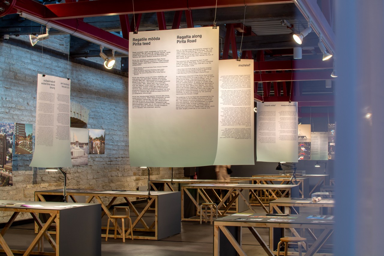
In 2024, the Estonian Museum of Architecture began preparing the exhibition Sailing Forward. How the 1980 Olympic Regatta Shaped Tallinn to mark the 45th anniversary of the Olympic Regatta held in Tallinn. It was decided early on that the exhibition would also highlight the designs by the Urban Design Group from the end of the 1970s and 1980s. Meetings and interviews with members of the group Matti Õunapuu, Taimi Soo, Tiit Jürna, and Silver Vahtre brought to light fascinating materials from the designers’ personal archives, including both outdoor objects, also called architectons, planned for the city centre and Pirita, as well as smaller design elements. The most exciting discovery was a large collection of original design sketches for Tallinna Infošrift that surfaced from Matti Õunapuu’s personal archive – ink drawings, letterforms drawn on tracing paper and various signage layout schemes. Until then, it was believed that only a few slide copies had survived, which would not have been sufficient to fully reconstruct the entire typeface.
Looking at the newfound material, it was quickly understood that it would not be enough to just exhibit these but rather, the typeface should be brought into active use. This led to the idea of digitising and modernising Tallinn Infošrift and using it as the foundation for the entire visual identity of the exhibition, just as it had once served as the basis for the design for the Regatta. Consequently, type designers Andree Paat and Aimur Takk (Tüpokompanii) were involved in the project to make sure updating the typeface would be done according to today’s typographic practices. This turned the original designs of Tallinna Infošrift not only into a museum object but also an active part of exhibition-making and communication.
Preparing the exhibition
A significant part of the process was interviews with the original designers, conducted with the aim to understand the conditions in which Tallinna Infošrift was created and to document their memories.
As the conversations were recorded, it became clear that the initial design brief in the 1970s was to adopt a systemic approach to the design of the city’s visual identity, which had so far been lacking. The task of Tallinna Infošrift was to make the visual presentation of the city clearer and more unified, using one typeface throughout Tallinn’s urban space and in some public buildings. The new version of the typeface was inspired by the craftspeople of the 1970s and 1980s and their skill in adapting their working methods according to the circumstances.
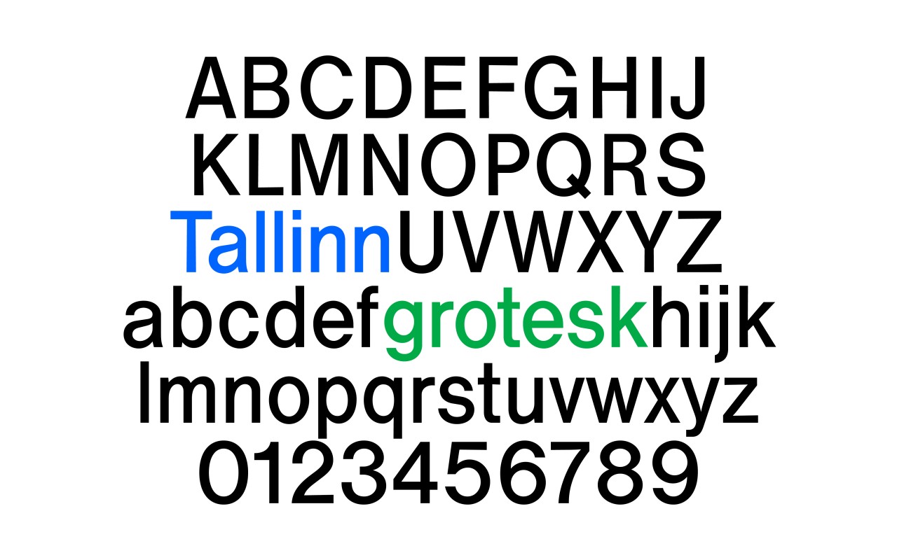
All available design sketches were scanned and compared during the digitisation process. The designers of Tüpokompanii decided which letters were to become the core of the new version, while trying to preserve the small imperfections and nuances of the letterforms. This was not about creating a new typeface but reviving what already existed. In the process it also became clear that it would not be fully a reconstruction – the original typeface acquired a new layer of design. That is why the updated typeface was named Tallinn Grotesk – to refer to both the original, Tallinna Infošrift as well as its grotesque-type forms.
When the first functional versions of Tallinn Grotesk were completed, testing the font out in the graphic elements of the design began. This process was led by designer Mirjam Varik. Experiments were made with posters, outdoor banners, digital materials and elements in the exhibition space. The typeface worked well on a large scale – the letterforms appeared in the city almost as a continuation of the graphic solutions from the 1979 Baltic Regatta that had taken place 46 years earlier. The designers also analysed how the digitised typeface performs as an element in the materials in the exhibition space. In the end, a solution was chosen, where the updated version of the typeface appears in titles for both the exhibition and in communications.
Therefore, the exhibition Sailing Forward. How the 1980 Olympic Regatta Shaped Tallinn exhibits the original designs for Tallinna Infošrift, however, for the exhibition design, Tallinn Grotesk was used. Such a curatorial decision allows the audience to experience the historical design process and its contemporary continuation as a unified whole. Based on feedback, it can be said that viewers noted how this approach helped them understand the role of typography in storytelling, highlighting elements that often go unnoticed in everyday life. So, viewers have come to realise that the typefaces featured in the exhibition are not merely exhibits but communication tools that showcase the history of local graphic design, adding an extra layer to the exhibition design.
Tallinn Grotesk is also enjoying wider use – the typeface is available under license and can be used in design projects. After the exhibition concludes, the original drawings will be deposited in the collection of the Estonian Museum of Applied Art and Design, ensuring both their preservation and accessibility to researchers in the future. Together with the designs, the Tallinn Grotesk digital typeface will also be added to the museum collection, preserving both the historical typeface and its updated version.
Tallinn Grotesk
A comment from type designers Aimur Takk and Andree Paat.
We had encountered this material before in Soviet-era street signs, which Andree began to pay conscious attention to during his studies at the Estonian Academy of Arts and has been documenting since 2014. Inspired by the lettering on street signs, Andree also created the Ladna type family, which he systematically tried to imbue with the amateurish, handcrafted character of the signs. Although most of the lettering on street signs cannot be directly considered Tallinna Infošrift, since the designers had no control over the production of the signs and the processes in the workshops can only be speculated on, certain letterforms had given us a feeling that the signs were based on typefaces of various origins. We kept hoping that one day we would find out more about these fonts.
We came closer to the truth when a few years ago Ivar Sakk informed us that there are photographic contact sheets of Tallinna Infošrift, a discovery that was truly surprising to us. We had never heard of this typeface specifically, perhaps only noticed it subconsciously in old Linnahall signs or on the facade of the Pirita Yachting Centre. It became clear that in part, this typeface was also used for street signs, although the finished signs were considerably different from the source material. Unfortunately, the contact sheets were not of the original drawings, which meant that a detailed digitisation process could not be undertaken based on these. At that point, our research came to a halt until this year, when, to our great delight, Grete Tiigiste informed us of the existence of the original sketches of Tallinna Infošrift and invited us to join the Sailing Forward exhibition team to digitise the typeface.
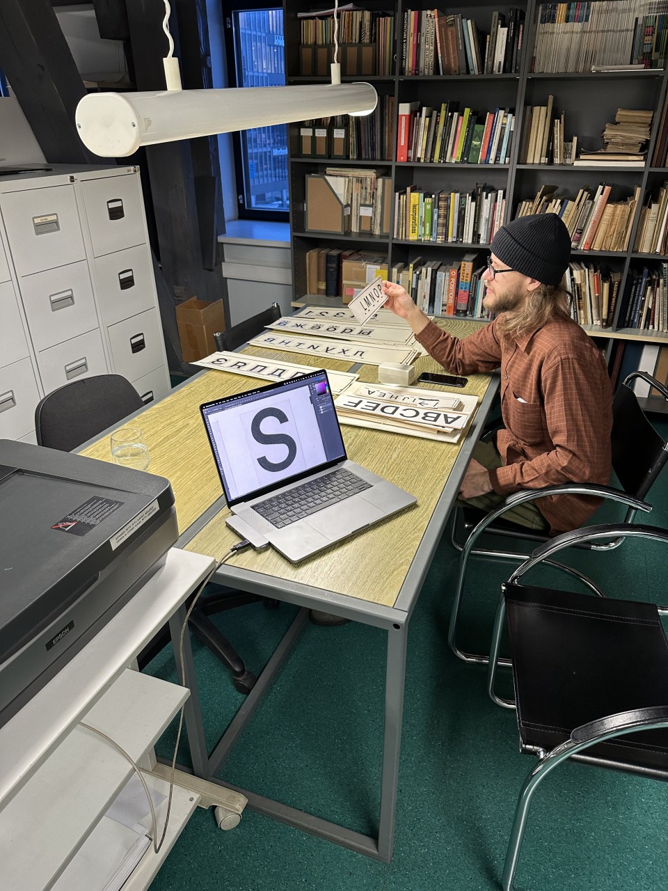
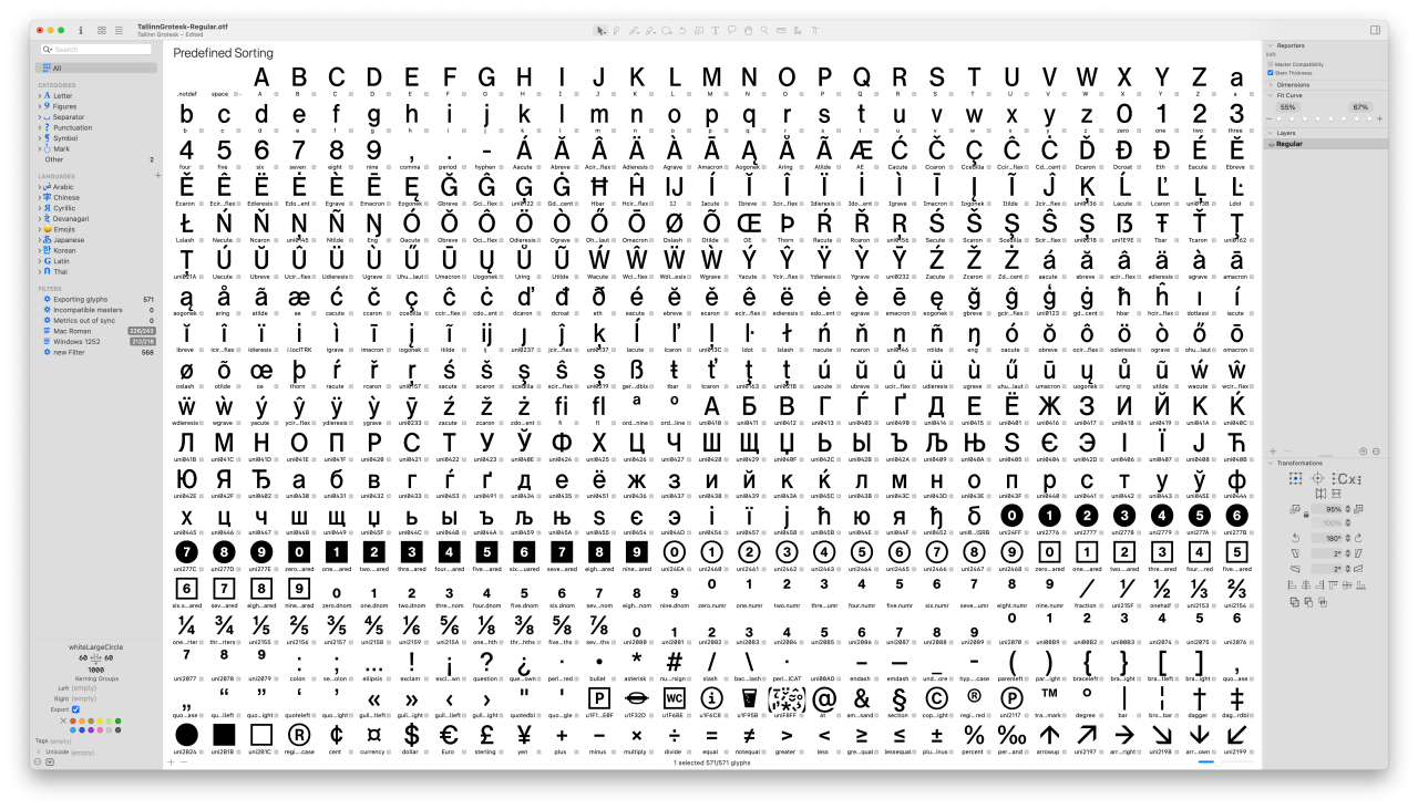
In the first phase, we scanned the sketches and photographic negatives at high resolution. We mapped all the characters and saved them individually as separate image files to streamline the workflow. Using these as a basis, we began digitally tracing the letters as accurately as possible, initially aiming to stay true to the original and avoiding smoothing irregularities too heavily. It was a pleasure to see how well Tiit Jürna had mastered the rules of optical lettering and how he had deliberately applied detailed adjustments to achieve a consistent texture in the typeface.
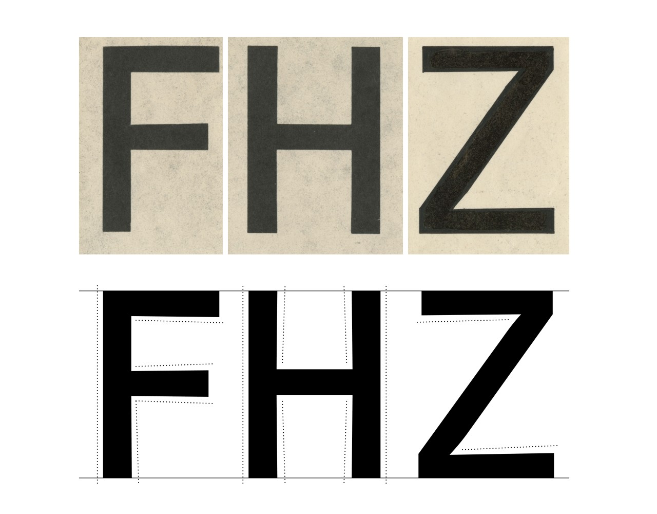
Talking to Tiit Jürna, he was modest about his position as the author, considering his work more as “hand-wobbling” than original creation. Perhaps this reflects the humble attitude typical of designers at the time, but we do not share this view. Jürna did honest work and drew up the typeface from scratch, making deliberate and sensitive design decisions, resulting not in a mere imitation of Helvetica but in a truly unique typeface with its own distinct character. Today, many type designers focus on reviving and interpreting existing materials and this approach is widely accepted, even encouraged in the field because otherwise, analogue typefaces would remain nothing more than museum pieces, gathering dust on archive shelves. Drawing upon someone else’s work is not seen as unoriginal but instead, these designers are seen as having as much authorship as those who created the source material – each interpretation is a work in its own right (unless it is theft, of course). Helvetica has been an inspiration for generations of type designers and continues as such today.
While the lettering in signs tends to be quite forgiving from the perspective of the viewer, in the case of digital fonts, inconsistencies become much more visible. We kept corrections to the minimum, unless we thought it unavoidable in order to keep a consistent overall look. We aimed to interfere with the original as little as possible, so that the originality and sensitivity of the material would also be present in the digital environment, where it is very easy to create overly clinical letterforms.

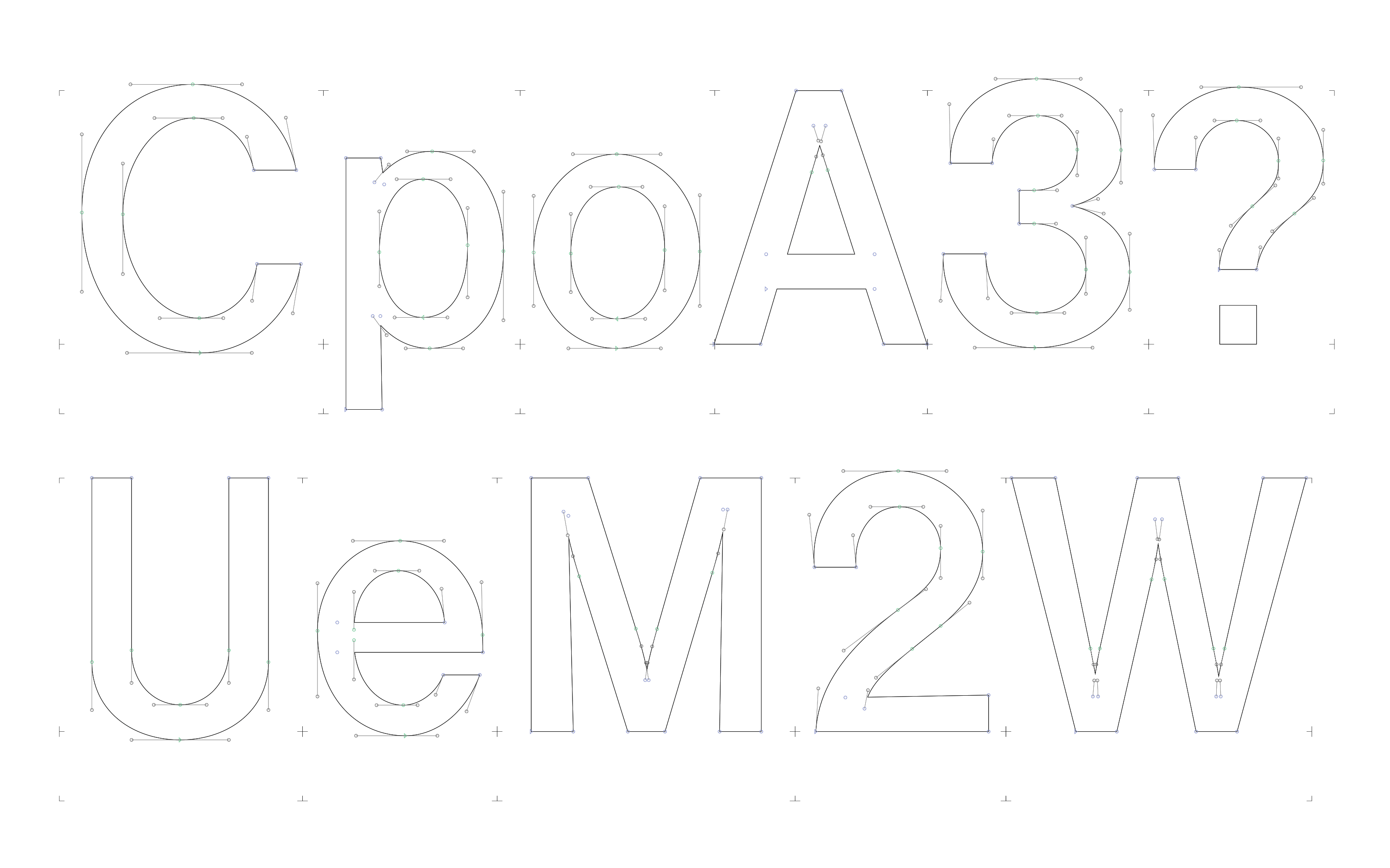
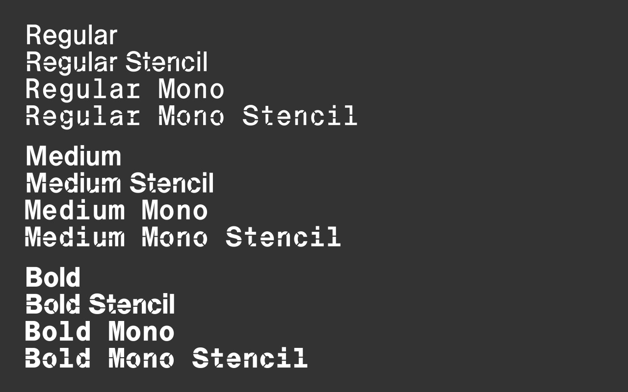
After working on the typeface for some time and becoming thoroughly immersed in it, we were ready to expand the font in the same style and add the missing characters. Fortunately, Jürna had already created the Cyrillic letters, so we were able to add a few diacritics, currency and other symbols as well as punctuation marks. Also, it was a joy to discover the occasional icons found in the drawings of the Pirita Yachting Centre signs, for things like “hot dog” and “soft drink”, which we added to the character set. In total, Tallinn Grotesk currently includes over 500 different characters. The work on the typeface is ongoing, with plans to add several styles, such as Monospace and Stencil, in various levels of boldness, so that, in the end, a comprehensive type family to satisfy the needs of all information signage applications.