Published on 28.11.2025
Sunny Lei is a graphic designer from Gadigal/Sydney, currently based in Tallinn. She is completing a Master of Arts in Graphic Design at the Estonian Academy of Arts. Her research considers existing materials and paratexts, exploring the dialogue between typography and language.
“We see as we are told,” curator Ingrid Schaffner writes in the anthology What Makes a Great Exhibition.1 Artwork labels, a physical card accompanying a work of art in an exhibition, form a threshold between the artwork and its audience, influencing how the viewer approaches and understands the work. While these small texts appear objective, bearing a work’s vital data (artist, title, date, medium, collection), they are also deeply shaped by curatorial authority and design labour. Serving not only as informational tools, they operate as a form of translation open to interpretation. As art critic Orit Gat observes, “reading has become a part of looking,” reflecting on the view that artwork labels have become an inseparable part of understanding art.2
What forms of labour are involved in producing artwork labels? What does our habit of reading before looking reveal about our desire for language to fix meaning? These questions highlight the complexity of museum paratexts and their effects on the engagement and pacing of an exhibition.
Paratext (meaning “beside text”) refers to elements surrounding a main content designed to introduce or contextualise for the reader. In a museum, introductory wall texts, artwork labels, artist biographies, maps, audio guides and warning signs are carefully designed paratextual elements that mediate the experience of an exhibition through framing content and context.
In the essay Wall text, 2003/6. Ink on paper, courtesy of the author, Schaffner asserts that wall texts are a key curatorial responsibility that should be approached as an “opportunity to transmit insights, inspire interest, and to point to the fact that choices have been made”.3 As a form of ephemeral literature, wall texts shape initial impressions of an exhibition by subtly guiding the audience on how to perceive the works and navigate the space. This guidance, however, relies on the accessibility and comprehension of language. Coined by critics Alix Rule and David Levine in their 2012 essay for Triple Canopy, they described International Art English (IAE) as a “problematic writing intentionally adopted by the art world to distinguish between elite and non-elite audiences”.4 Writer Shweta Nandakumar echoes the issue of IAE jargon in her essay Don’t Read the Wall Text, through her experience at the Kochi-Muziris Biennale as an example. Nandakumar observed that the Biennale’s website, with its “unnecessarily complicated vocabulary and syntax [was] clearly not for everyone”.5 She argues that this jargon acts as “a barrier [...] a form of exclusion in what’s billed as ‘the People’s Biennale’”.6
Despite these critiques, concluding that wall texts for contemporary art are inherently superfluous would be to “deny the complexity and creativity of a curatorial practice”.7 Schaffner emphasises that wall texts, “as a writerly text”, should be “approached strategically and creatively – or should not be used at all”.8 She reminds us that “[l]anguage can be rigorous, or colloquial, as long as the overall tone is generous”.9
This generosity, however, is not just a matter of tone but also of meticulous physical labour, a fact I became acutely aware of during my time working as a graphic designer at art institutions in Sydney and Melbourne. Depending on the nature of the exhibition, artwork labels may be less distracting when blended with the wall as much as possible. In one instance, I remember laboriously colouring the four edges of hundreds of labels with a copic marker so it blends seamlessly into the coloured wall when viewed from the side. Often I find myself examining the design and production of labels more closely than the artworks themselves. Despite their minimal appearance, each label is the result of a complex production chain – from research, curatorial review, typesetting, colour matching, printing, trimming, and installation. Careful attention to typographic hierarchy and spatial placement is not just about aesthetics – it influences how meaning is absorbed, as well as an indication of “the level of care and custodianship an institution has for patrons”.10
In Estonian museums, I noticed that the dual presentation of Estonian and English is a common protocol. Typographic hierarchy plays a crucial role in ensuring the legibility of these texts. At They Began to Talk, an international group exhibition at Eesti Kunstimuuseum (KUMU), the artwork labels use a serif typeface for Estonian text and a sans-serif for English. This considered choice of differing typefaces assists both legibility and the viewer’s logic or “way of reading” the information. The emphasis on artist names and titles in larger type sizes directs the reading order, while the medium details are set in a smaller type size as secondary information. Moreover, the careful colour matching of the labels to the wall color also contributes to their subtle integration within the environment.
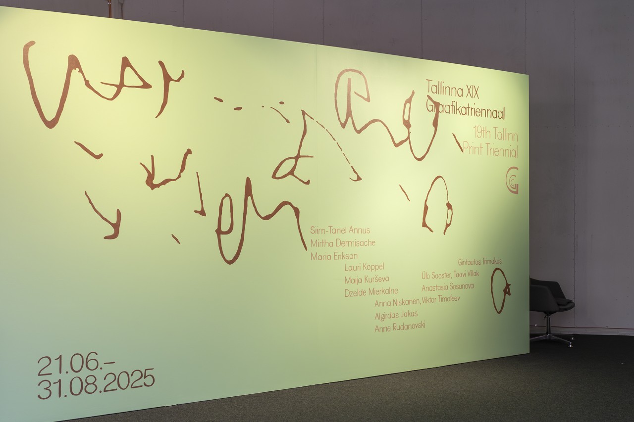
The Tallinna XIX Graafikatriennaal (19th Tallinn Printmaking Triennial), which opened in June 2025 at Tallinn Art Hall’s Lasnamäe Pavilion, illustrates the often-invisible labour involved in exhibition graphic design. The hand-painted title wall created with remarkable care and detail is an example of this. Graphic designers Paula Buškevica and Louise Borinski revealed this was a deliberate choice by the institution to reduce non-recyclable plastic waste such as printed vinyl. Handpainted title walls had already been an existing framework in previous exhibitions at the Lasnamäe Art Pavilion. The designers prepared a file to be projected on the wall, that was then handpainted by artist Solveig Lill.11 This approach contrasts sharply with the common practice in Australian art galleries, where vinyl adhesive is favoured for its ease of application and polished look. While vinyl can be quickly reprinted and replaced if a mistake is made, it is an inherently wasteful method. The triennial’s embracing of hand-painting, though time-consuming, signals an environmental awareness and appreciation for physical labour: a method often replaced by the convenience of digital printing.
This focus on the unseen effort behind the scenes becomes more pronounced when we consider exhibitions where the artwork itself is absent, forcing the viewer to rely entirely on paratexts to activate meaning. This was the case in 2009 when Centre Pompidou displayed an exhibition titled Vides: Une Retrospective (Voids: A Retrospective). The show brought together nine past exhibitions where the artist left the exhibition space completely empty. Curators John Armleder, Mai-Thu Perret, Mathieu Copeland, Gustav Metzger, and Clive Phillpot chose to simply present these works through other vacant, unaltered spaces. Occupying a section of the fourth floor at the Centre Pompidou, a space usually dedicated to the museum’s permanent collection, this decision maximises exposure through positioning it in a space with high foot traffic. As all nine rooms were empty, large wall texts and artwork labels became an essential part in distinguishing between “art” versus empty space. The exhibition completely depended on these texts to “conceptually reactivate” the works.12
One of the works was Yves Klein’s controversial 1958 exhibition, Le Vide (The Void), at Galerie Iris Clert in Paris. Klein painted a room entirely white with no artworks on display as a radical statement about the “potential within emptiness [...] a space for experiencing the immaterial.”13 The original exhibition featured a sophisticated ceremony with International Klein Blue (IKB) coloured drapery and painted windows on its opening night. The experience hinged on the contrast going from a sharp blue entrance to an empty white interior. The wall texts at Pompidou did not mention this detail, nor that Klein used his special IKB formula with white pigment instead of blue to paint the walls. This specific formula retained the vividness of pure pigment and produced an irregular surface. By selectively focusing on the experience of Le Vide, many audiences were left confused. Ironically, while the wall texts encouraged viewers to seek meaning within the white walls, it instead redirected them to the exhibition catalogue for further understanding.
Ultimately, the exhibition catalogue served as the real survey, pertaining valuable information and essays that delved into the conceptual art of emptiness. Such reliance on a separate, more detailed catalogue may indicate that the wall texts and exhibition format itself were an inadequate way to communicate its agenda.
This shortcoming sharply contrasts with the deliberate and powerful use of language in another context of absence, as seen in the work of NO PHOTO 2025. On the streets of Arles, pairs of large paste-up posters began appearing during the International Festival of Photography, Rencontres d’Arles 2025. The poster series shows a large black rectangle, coupled with text describing the unseen image. One reads:
The limbs of two children on a blanket, yet to be identified. Feet riddled with shrapnel wounds. A baby’s hand, their tiny fingernails peeking through grey dust, like pearls.
Both posters are captioned: Majdi Fathi, Gaza City, 18 May 2025.
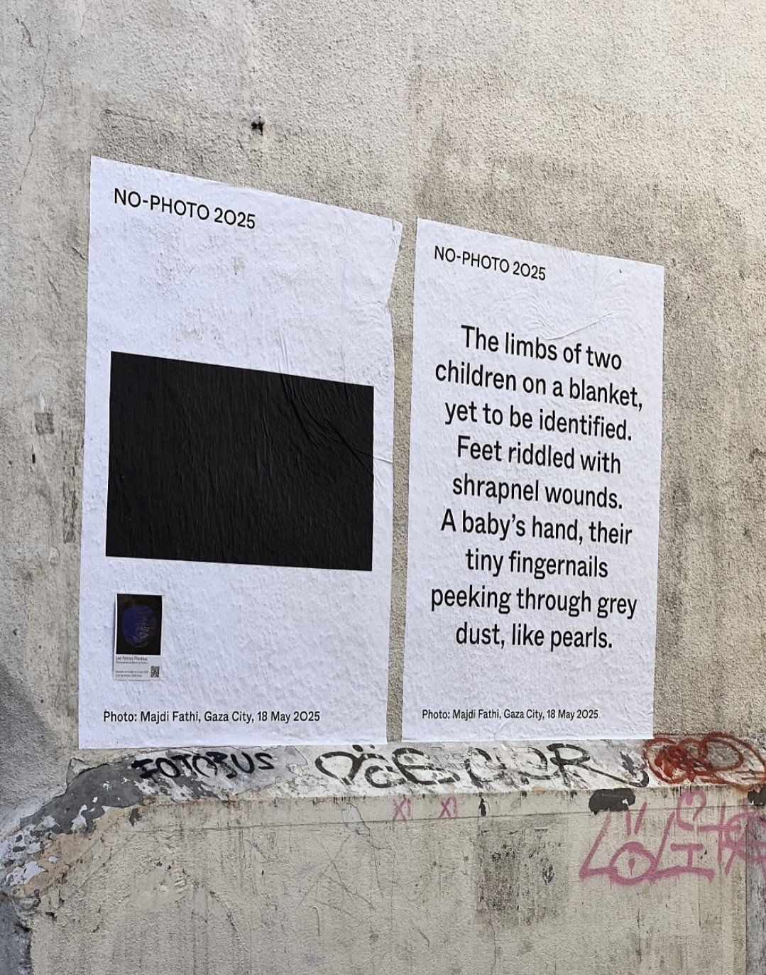
NO PHOTO 2025 are an anonymous group of international artists and activists who aim to shine light on the work of Palestinian photographers and journalists in Gaza. As a counter festival initiative, it prompts collective reflection on how images, or the lack thereof, can “mobilise public opinion, and contribute to the struggle for human rights and social justice”.14 Photography holds the potential to bear witness to atrocities, but the blacked-out images are a reflection of the absent representation of Palestinian subject matters in the festival’s curation.15 This becomes particularly sharp in a context that centres the photographic image as a platform for disseminating knowledge of social and political issues. The exclusion of these images is evidence of institutions’ complicity, prioritising financial backing over moral responsibility. The fear of ostracisation from economic partners dictates their actions, contradicting their stated mission to champion art and culture – “the supposed domain of free and radical ideas”.16
The simplicity of black sans-serif text on a white background is arresting and direct. The caption texts are written in a “humanist interpretation based on an empathic view”, highlighting an “emotional, poetic or political position” on the subject matter.17 These image descriptions are what writer Sunil Shah calls “an ekphrasis of sorts but really a rendition of a poetic alt-text”.18 Devoid of images, NO PHOTO 2025 is a moving testament to the power of language when it is intentionally on display beyond the confines of a museum. Viewers of the festival were not asked to be merely a reader, but an interpreter, bringing their own sense of meaning to the text and the black rectangle on view. This process of translation, using non-visual terms, provokes the question of “who deserves to be mourned” – reminding us why the unseen horrors are deliberately not on display and what it means to witness these interventions in a public space. One of their main statements is “we refuse to accept the political aesthetics without political accountability [...] we stand together against the forces that refuse to let us.”
Serving as a powerful call to action, the texts in NO PHOTO 2025 posters promote vital conversations about “ethical responsibilities of creating, curating and consuming photographs”.19 The unseen image serves as “anti-image”, prompting its audience to “move beyond aesthetic appreciation” and instead, engage with images through dialogue and imagination.20
However intentional, temporary or replaceable, museum paratexts are narrative instruments that hold “an endless loop of authority” to guide the experience of an artwork or exhibition.21 Behind each label is a meticulous process informed by curatorial intent and design positioning. Through this critical framework, paratextual elements such as artwork labels, wall texts, and catalogues reveal a tension between artistic essence, storytelling and authority in exhibition spaces. While the wall texts of the Voids exhibition attempted to conceptually reactivate works in a new institutional setting, NO PHOTO 2025 demonstrates the political potential of ‘alt-texts’ in a public space. This consideration of exhibition paratexts provokes a final question: does our ritualised habit of ‘reading’ the museum allow us to escape the difficult task of interpretation, or does it reflect a “desire for anchorage”, a need to seek meaning through textual reassurance?22
References
- Ingrid Schaffner, ‘Wall text, 2003/6. Ink on paper, courtesy of the author’, What Makes a Great Exhibition, (2006) <https://ingridschaffner.com/2013/06/wall-text-what-makes-a-great-exhibition> [accessed 31 July 2025].
- Orit Gat, ‘Could Reading be Looking?’, e-flux Journal, (2016) <www.e-flux.com/journal/72/60501/could-reading-be-looking> [accessed 18 July 2025].
- Ingrid Schaffner (2006).
- Alix Rule and David Levine, ‘International Art English’, Triple Canopy, (2012) <https://canopycanopycanopy.com/contents/international_art_english> [accessed 1 August 2025].
- Shweta Nandakumar, ‘Don’t Read The Wall Text’, Public Seminar, (2023) <https://publicseminar.org/essays/dont-read-the-wall-text> [accessed 1 August 2025].
- Ibid.
- Ingrid Schaffner (2006).
- Ibid.
- Ibid.
- James Nguyen, ‘Reading Wall Labels At Documenta and the Venice Biennale’, Runway Journal, (2017) <https://runway.org.au/conversations/reading-wall-labels-by-james-nguyen> [accessed 20 July 2025].
- Paula Buškevica and Louise Borinski, interview with the authors, 11 August 2025.
- Jian-Xing Too, ‘Voids: A Retrospective’, ArtForum <www.artforum.com/events/voids-a-retrospective-198099> [accessed 2 August 2025].
- The Art Story, ‘Yves Klein’, The Art Story <www.theartstory.org/artist/klein-yves> [accessed 2 August 2025].
- Cherine Fahd, ‘Guerrilla festival no-photo2024 is highlighting the unseen work of Palestinian photographers in Gaza’, The Conversation, (2024) <https://theconversation.com/guerrilla-festival-no-photo2024-is-highlighting-the-unseen-work-of-palestinian-photographers-in-gaza> [accessed 1 August 2025].
- Ibid.
- Sunil Shah, ‘No Photo 2025’, American Suburb X, (2025) <https://americansuburbx.com/2025/07/no-photo-2025.html> [accessed 1 August 2025].
- Ibid.
- Ibid.
- Cherine Fahd, ‘Guerrilla festival no-photo2024 is highlighting the unseen work of Palestinian photographers in Gaza’, The Conversation, (2024) <https://theconversation.com/guerrilla-festival-no-photo2024-is-highlighting-the-unseen-work-of-palestinian-photographers-in-gaza> [accessed 1 August 2025].
- Ibid.
- Orit Gat (2016).
- Roland Barthes, ‘Rhetoric of the Image’, in Image, Music, Text, ed. and trans. by Stephen Heath (London: Fontana Press, 1977), pp. 32–51.