Published on 3.07.2026
Muj Abdulzade (she/her) is a Berlin-based designer and educator working across collage, writing, and community building. She completed her master’s studies at Bauhaus Dessau in Germany where her research examined gender bias in pictograms. She currently teaches as an external lecturer at Berlin International University. She loves working on projects that go beyond graphics and revolve around spaces designed for learning, reflection, and knowledge production. Her current practice focuses on exposing and critiquing the oppressive structures of corporate environments through publishing and visual deconstruction.
Pictograms are often framed as design’s most innocent invention: a universal visual language, stripped of ambiguity and capable of transcending linguistic and cultural difference. Within this narrative, they promise clarity where words fail, an efficient system of communication for a globalised world. Yet, this idea of universality is less a neutral achievement than an ideological construction.1 Pictograms do not exist outside of context. They are produced within specific political, cultural, and economic conditions. Their legibility is never innocent, but shaped by the power structures that demand and perpetuate it.
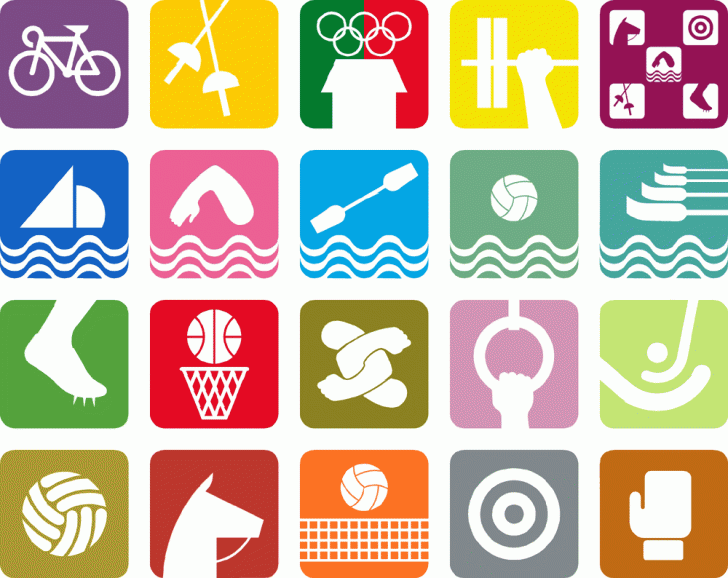
The 1968 Olympic Games in Mexico City are frequently positioned as a defining moment in the history of pictogram design. The visual identity developed for the Games is widely celebrated for its coherence, vibrancy, and systematic ambition – particularly its pictogram set, which notably avoids depicting the human body and instead focuses on the functionality of sports equipment and movement. The 1968 Games marked a shift toward fully integrated design campaigns, in which signage, branding, architecture, and media were brought together under a unified visual logic. At the centre of this narrative stands Lance Wyman, a 29-year-old American designer who arrived in Mexico for what was initially a two-week trial, having never visited the country before. Within a remarkably short time, he became deeply involved in shaping the visual language through which Mexico would present itself to an international audience.
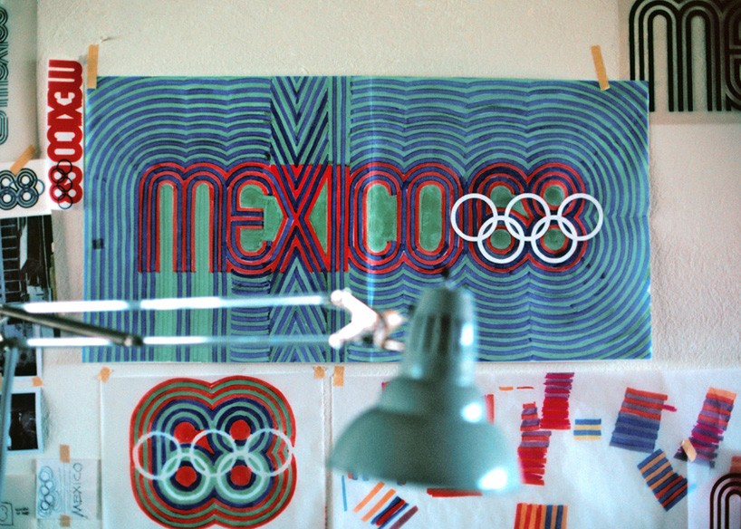
This origin story, however, is partial. Before Wyman’s involvement, students from the Universidad Iberoamericana in Mexico City had already begun developing pictographic concepts for the Games. In January 1967, Wyman won an international competition and took over the project’s development. What followed was not the work of a single author, but a collaborative process involving Mexican designers and art directors such as Eduardo Terrazas, Manuel Villazon, students and institutional actors. Yet, design history has largely consolidated authorship under Wyman’s name. This erasure of collective labour is not incidental, it reflects broader patterns within design discourse, where authorship is often attributed to a singular, recognisable (and frequently Western) figure, while local contributions are minimised or omitted.
At this point, the question of copying becomes unavoidable. If the Mexico 68 system is built on references to Indigenous visual cultures, to international modernism, and, as Wyman himself acknowledged, to earlier Olympic pictograms, then what exactly constitutes originality? Where does authorship begin, and where does it dissolve into a network of influences, appropriations, and borrowed forms? In design, copying is often framed as a problem of ethics or legality, but here it reveals something more structural: that visual languages are always already composite, shaped by unequal access, visibility, and recognition. The issue is not simply that something is copied, but who is allowed to copy, from whom, and under what conditions that act is legitimised as design.
Wyman himself has described his process as one of immersion. A visit to the National Museum of Anthropology proved formative as it would for many visitors encountering Mexico’s curated cultural heritage. There, he encountered geometric patterns derived from pre-Columbian artefacts, which he later incorporated into the Olympic identity. These forms were combined with the perceptual strategies of OpArt, producing a distinctive visual system characterised by rhythmic lines, optical vibration and modular clarity.
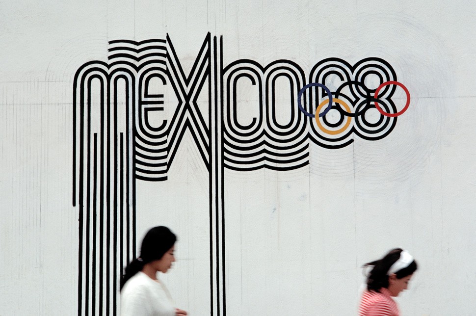
However, this narrative of inspiration requires a more critical reading. What is at stake when a young white designer, newly arrived and working under a government commission, extracts visual references from Indigenous material culture and appropriates them within a global branding project? The language of influence risks obscuring a dynamic of translation and appropriation, in which culturally specific forms are detached from their histories and reassembled as aesthetic resources. In this process, complex visual traditions are flattened into stylistic motifs, made legible within the frameworks of international modernism, while their original meanings remain unacknowledged or inaccessible.
The resulting design is often celebrated as a successful fusion of traditional and modern elements. Yet this framing depends on a separation that design itself produces: the positioning of Indigenous visual languages as historical, static, and available for reinterpretation, and of modernist design as the active force that recontextualises them. What appears as synthesis can also be understood as a form of extraction, in which cultural specificity is mobilised to support a constructed national identity aligned with global expectations of modernity.
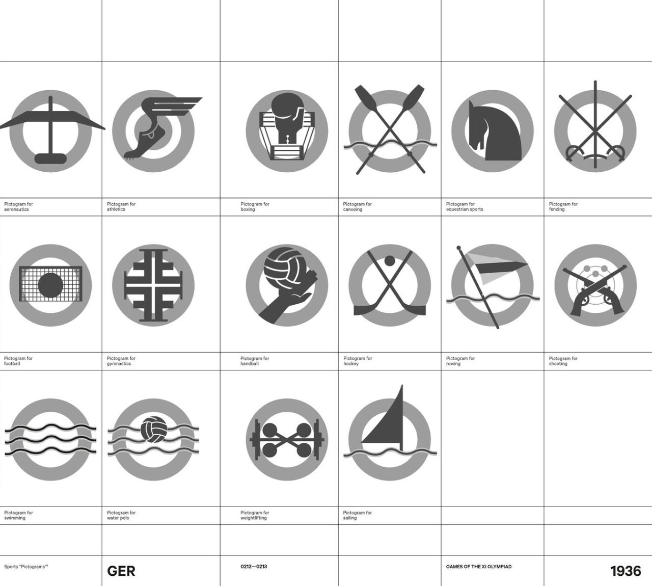
This dynamic becomes even more complex when considering the longer lineage of Olympic pictograms. Despite the International Olympic Committee’s efforts to distance itself from its dark past, the first modern Olympic pictograms were introduced at the 1936 Berlin Games under Nazi Germany. There, visual communication was instrumentalised to project ideological clarity, order, and racialised nationalism. The Games functioned as a propaganda platform for the Third Reich, embedding design within a machinery of exclusion and violence.
In the spring of 2020, I was working on my master’s thesis Man as Default: Revealing Gender Bias in Pictograms.2 That project first led me into the world of the Olympics, as they have long served as a key site for the use of pictograms designed to function as a shared visual language for audiences across different linguistic backgrounds. As I examined pictogram sets from different Olympic Games, the recurring figure of the “default” male body became increasingly difficult to ignore. This pattern persisted across decades, until I arrived at the Mexico 1968 chapter. These pictograms stood out to me: as mentioned before in the article, unlike earlier examples, they moved away from depicting the human figure and instead focused on the functionality of the sport itself.
This shift made me wonder whether the designers were consciously attempting a more inclusive approach in terms of gender representation. Questioning that assumption ultimately led me to reach out to Lance Wyman. I invited him to a Zoom conversation, which he generously agreed to, and that exchange became an important entry point for understanding how the focus of the design process was less on questions of gender, and more on finding the most effective visual way to communicate each sport.
During our conversation, Wyman himself referred to the Berlin pictograms as among the “best designed,” even while acknowledging their very violent historical context. This uneasy admiration points to a continuity that design history often avoids: that formal innovation can and often does emerge within deeply problematic political conditions. The visual similarity between Berlin 1936 and Mexico 1968, particularly the focus on sports equipment over human figures, suggests that these design lineages are not as disconnected as they are often presented.
The political ambitions of Mexico 1968 cannot be separated from this history. The Games marked a moment in which host nations increasingly used design as a strategic tool to project themselves onto the global stage. The visual system was not only tasked with orienting visitors but with communicating a narrative of progress, stability, and international belonging. Pictograms, with their promise of universality, were central to this effort. Their apparent neutrality made them effective carriers of an image that needed to appear self-evident.
At the same time, this projection of modernity was unfolding against a backdrop of profound political unrest. The year 1968 was marked by widespread protests across the globe, and in Mexico, student movements were actively challenging state authority, demanding democratic reform, and resisting systemic inequality, also directly critiquing the Olympics as a spectacle of false modernisation. Demonstrations intensified throughout the year, culminating in the events of 2 October, when hundreds of students were killed by government forces in the Tlatelolco massacre, just ten days before the opening of the Olympic Games.3
This moment exposes a stark contradiction. The same state that commissioned a visual language of openness and global unity was simultaneously enacting violent repression. The Olympic design system, in this context, cannot be understood as a neutral layer placed atop political reality. It functioned as part of a broader apparatus of representation, one that sought to stabilise meaning and maintain an image of coherence in the face of extreme violence. Design here operates not only as communication, but as mediation: structuring what is visible and what remains obscured.
As discussed in the 99% Invisible podcast, Wyman has described his own position during this period as one of relative isolation, focused on the demands of the project during the two years he spent in Mexico working on this government commission.4 Yet this distance does not place the work outside of its context. On the contrary, it highlights how design labour can become embedded within systems of power precisely through its focus on clarity and functionality. The production of order, legibility, and cohesion can function as a way of smoothing over conflict, producing a surface that conceals the tensions it depends on.
And yet, the visual system did not remain under the control of its commissioners. In a significant and often overlooked turn, student activists began to appropriate the graphic language of the Olympics, deliberately mimicking and distorting its visual authority. Olympic typography and graphic patterns were reused in protest posters, while pictograms were altered to depict scenes of violence, repression and resistance. Rather than rejecting the visual language outright, students occupied it, turning its propaganda logic against itself.
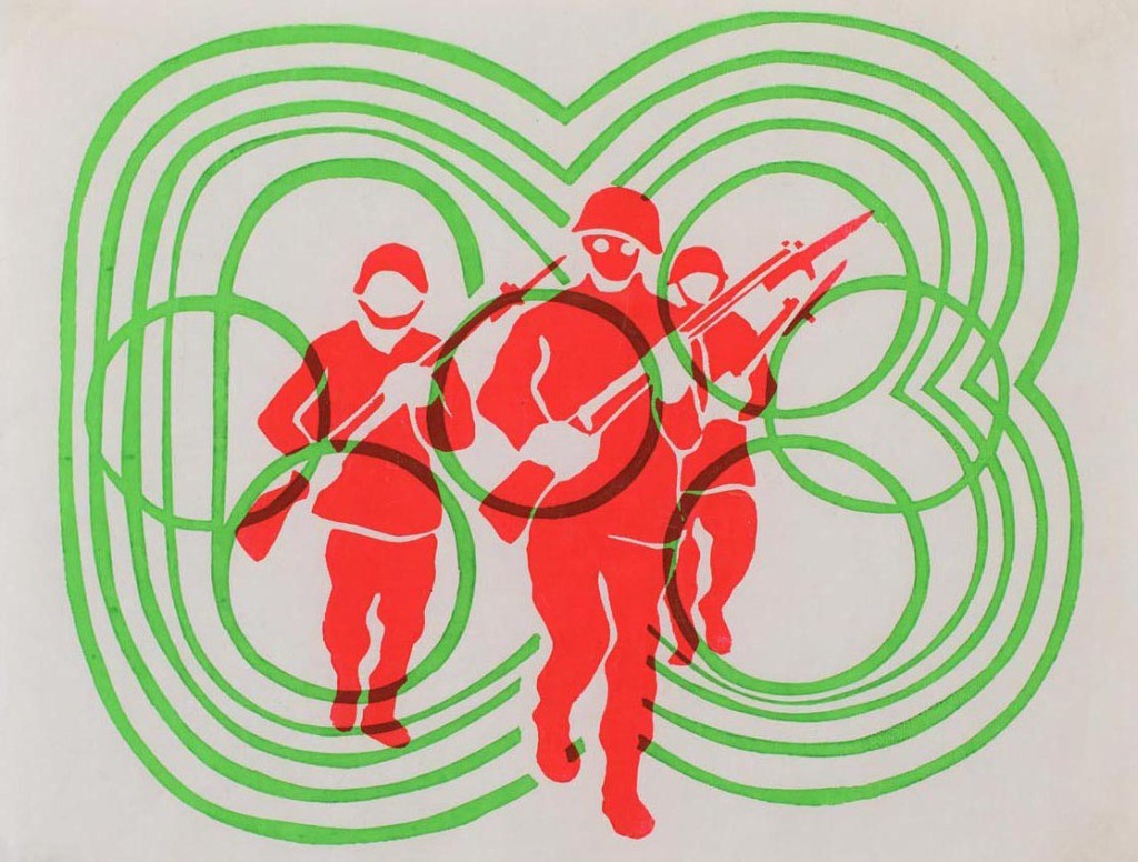
Here, copying shifts its meaning once again. If the state’s use of visual language relies on controlled repetition and consistency, the students’ interventions introduce friction, excess and contradiction. Copying becomes a tactic rather than a derivative act – a way of exposing how meaning is constructed and who gets to control it. The question is no longer whether something is original, but what copying does, and for whom it works.
This act of appropriation reveals the instability of pictograms as supposedly universal signs. Their meaning is not fixed but fluid, shaped by context, use and circulation. The same graphic forms that functioned as instruments of state messaging could be mobilised to expose the contradictions of that messaging. Rather than transcending language, pictograms became sites where competing political languages intersected.
The Mexico 68 identity thus operates within a set of tensions that are often smoothed over in design histories. It is at once a landmark achievement in graphic design and a case study in how design participates in the construction of national narratives that exclude and suppress. It demonstrates how visual systems can operate as infrastructures of power, organising perception and producing a sense of coherence that masks underlying violence.
At the same time, its afterlife points to the limits of that power. Once released into the world, the visual system exceeded the intentions of its authors. It became a contested terrain, shaped as much by those who resisted it as by those who designed it. The students’ interventions did not simply invert its meaning; they revealed its openness, its vulnerability to reinterpretation.
Revisiting Mexico 68 through this lens challenges dominant histories of graphic design that privilege formal innovation over political context. It also complicates the notion of authorship itself. If design is always already a process of referencing, borrowing and translating, then authorship cannot be reduced to a single name. Instead, it must be understood as distributed, uneven and often contested.
Pictograms, in this sense, are not simply tools of communication. They are instruments that structure how information is organised, how bodies move through space, and how narratives are made legible. Their apparent simplicity conceals the complexity of the systems they support. The question, then, is not whether pictograms can communicate across difference, but how they participate in constructing that difference in the first place. Who defines what is legible? Whose visual languages are incorporated, and under what conditions? Who is credited, and who remains invisible? And how can these systems be interrupted, appropriated or reimagined?
Mexico 1968 does not resolve these questions, but it makes their urgency visible. It shows that even the most celebrated design systems are embedded in histories of power, and that their meanings remain open, contested, and subject to change.
References
- See more in my article The Dark Side of Pictograms, originally published for Futuress in 2021: <https://futuress.org/stories/the-dark-side-of-pictograms> [accessed 3 May 2026].[2] Mujgan Abdulzade, Man as Default (Master’s thesis, Anhalt University of Applied Sciences, 2020) <https://des.incom.org/project/911> [accessed 3 May 2026].
- Kara Michelle Borden, Mexico ’68: An Analysis of the Tlatelolco Massacre and its Legacy (BA thesis, University of Oregon, June 2005), p. 3.[4] Roman Mars, ‘The Art of the Olympics’, 99% Invisible, episode 591 (2022) <https://99percentinvisible.org/episode/591-the-art-of-the-olympics> [accessed 3 May 2026].