Published on 3.07.2026
Nerijus Rimkus is a graphic designer, typographer, student, carpenter, and father. Through his practice, he searches for the most fitting forms and enjoys the opportunity to collaborate with artists, curators, and writers. Rimkus completed his BA at the Gerrit Rietveld Academie and his MA at Werkplaats Typografie, both in the Netherlands; he is currently finishing his doctoral studies at the Vilnius Academy of Arts.
In the early 1980s in Soviet Lithuania, a group of teenagers known as “rollers” gathered at clandestine parties to listen to British ska bands and dance the twist. Their music came from smuggled cassette tapes; their style from fragments of Western magazines and rumours about London subcultures. They revived the music of Elvis Presley and Bill Haley, but also obsessively listened to bands such as Madness and Bad Manners. They danced the twist, styled their hair after New Wave fashions, and adopted elements of Western youth culture that had arrived only indirectly – through copied tapes, word of mouth, or occasional glimpses of foreign media.
Because these gatherings centred on Western music and fashion, they attracted the attention of Soviet authorities and were monitored by the KGB. Yet their rebellion took a curious form. By the early 1980s the West they imagined already looked different: the pop landscape had shifted toward artists such as Elton John, Duran Duran, and Wham!. The youth culture Lithuanian rollers were recreating had already passed elsewhere. What emerged instead was a hybrid subculture that existed nowhere else – part 1950s rock-and-roll revival, part British ska revival – a youth movement nonetheless.
The contemporary art platform Echo Gone Wrong, which publishes on the Lithuanian, Latvian, and Estonian art scenes, takes its name from this history.1 The phrase refers to a song by the ska band Bad Manners and captures the phenomenon of Western cultural signals that arrive in the Soviet periphery late, fragmented, and distorted by censorship and distance.
These echoes – half imitation, half invention – reveal something essential about cultural life in the late Soviet Baltic states. Copying was rarely a straightforward imitation. It often became a subtle, sometimes unconscious form of creative resistance. Subcultures, designers, and consumers did not simply replicate Western forms; through the veil of isolation they misread, hybridised, and localised them, producing results that diverged significantly from their sources. The most interesting cases are precisely those where copying failed – where translation from one cultural context to another produced distortion.
To imagine the conditions under which such distortions occurred, one might picture a world in which nearly everything known about another culture arrives as rumour or fragments. In this sense the logic resembles the imaginative reasoning of children trying to understand adult life – a sensibility memorably captured by the American children’s author Ruth Krauss in her 1955 book A Hole Is to Dig. In the Soviet context, this childlike interpretive process was not merely metaphorical. Cultural knowledge about the West was indeed partial, improvised, and speculative. But to understand how such echoes formed, it is interesting to go back two decades earlier, when designers and consumers in Soviet Lithuania first began encountering fragments of Western culture. One of the clearest examples concerns denim.
Denim trousers – jeans – originated in the United States in the nineteenth century as durable workwear. In 1873 the tailor Jacob Davis and the merchant Levi Strauss patented the use of copper rivets to reinforce work pants made from denim fabric, creating what would later become the iconic blue jean. Initially worn by miners, cowboys, and railroad workers in the American West, jeans entered popular culture during the mid-twentieth century.2 In the 1950s they became associated with youth rebellion after being worn by actors such as James Dean and Marlon Brando in films that helped establish denim as a symbol of teenage defiance. By the 1960s and 1970s jeans were widely adopted by countercultural movements in the United States and Western Europe, where their informality represented a rejection of bourgeois dress codes. In Soviet Lithuania, original Western jeans – particularly those produced by brands such as Levi’s or Wrangler – could cost the equivalent of several monthly salaries. They were not only expensive, they were also scarce and very hard to obtain. Research by Lithuanian scholar Brigita Tranavičiūtė3 has shown that Western brands gained strong symbolic value in this context. Labels mattered as much as the garments themselves; sometimes even counterfeit Western labels were enough to elevate an otherwise ordinary piece of clothing into a status symbol. The meaning of wearing or owning a pair of denim trousers as a consequence, of course, also changed dramatically: they were treated not as casual everyday clothing but as luxury items. Owners preserved them carefully and often wore them only on special occasions such as weddings, holidays, or graduation celebrations. A garment designed in the United States to symbolise relaxed informality became, in Soviet Lithuania, a marker of prestige and rarity. Rather than reproducing the social meaning denim had in Western culture, the Soviet context effectively inverted it.

Similar distortions occurred in the field of graphic design. During the 1960s and 1970s, for example, Lithuanian designers encountered Western psychedelic and pop-art aesthetics through limited access to publications and exhibitions. In the West, these styles were associated with the psychedelic music scene, anti-war movement and counterculture that formed around the hippie movement in the United States and the United Kingdom. The term psychedelic itself refers to hallucinogenic substances such as LSD (lysergic acid diethylamide), which became associated with artistic experimentation, altered perception, and spiritual exploration during that decade. Artists and designers attempted to translate the visual distortions and sensory intensification associated with psychedelic experiences into graphic form. The visual characteristics of psychedelic design were immediately recognisable. Posters often used intensely saturated colors – electric purples, oranges, and neon greens – placed in high contrast so that the image seemed to vibrate. Lettering was deliberately distorted or melting, sometimes becoming so elaborate that it was difficult to read. In the West, they were a visual expression of a rebellion against mainstream culture. Their deliberately chaotic typography and overwhelming colour combinations rejected the clean rationalism of postwar modernist design. This is what makes their later reinterpretation in Soviet Lithuania so striking. When Lithuanian designers encountered fragments of psychedelic imagery through magazines, exhibitions, or imported printed material, the political and cultural meanings attached to these forms often disappeared. What remained were only the visual features.
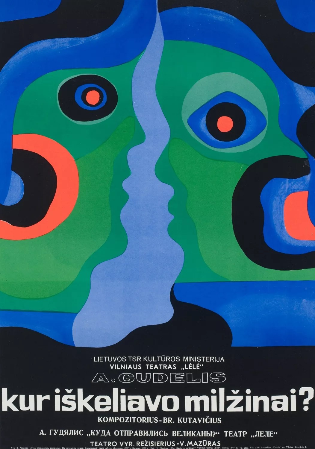
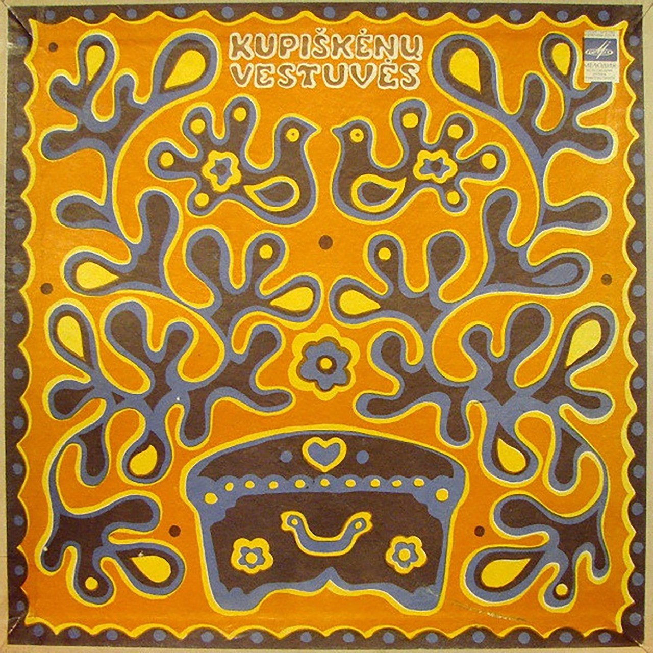
Art historian Deima Žuklytė-Gasperaitienė has documented how designers such as Juozas Galkus and Arvydas Každailis incorporated elements of psychedelic visual language – undulating lettering, vibrant colours, and optical distortion – into Lithuanian graphic design. Instead of illustrating rock concerts or underground publications, however, these stylistic features frequently appeared in children’s books and folklore illustrations. Designers such as Birutė Grabauskienė used swirling shapes and intense colour contrasts to depict fairy-tale landscapes and mythological creatures. Children’s publishing offered a relatively safe space for experimentation. Soviet cultural authorities often regarded visual fantasy in children’s media as harmless and apolitical, allowing designers greater stylistic freedom than in other artistic fields.4
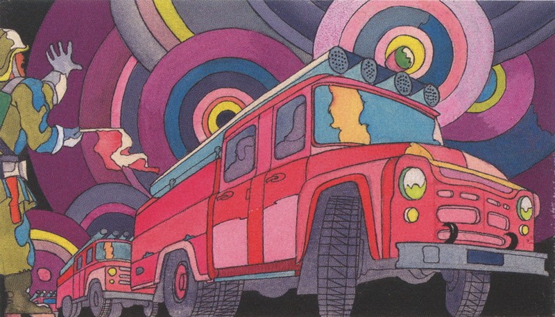
This loophole enabled graphic artists to experiment with abstraction and colour in ways that would likely have been rejected in official fine-art exhibitions. The result was an unexpected transformation: the visual language of the Western psychedelic rebellion of free love reappeared in the context of illustrations in children’s literature. One very striking example of this is an illustration created in 1972 by Arvydas Každailis. The drawing depicts a Soviet GAZ-53 fire truck – a utilitarian vehicle widely used across the USSR – covered with brightly colored psychedelic patterns reminiscent of the painted Volkswagen Type 2 vans associated with Western hippie culture. Beside the truck stands a Soviet officer, appearing almost symbolically, one hand in the air, seemingly wanting to restrain the eruption of colour applied to an object which in daily life was associated with functional greyness.

The circulation of Western design languages also appeared in corporate identity systems. Graphic designer Rokas Sutkaitis studied Soviet logo design and noted visual parallels between certain late-Soviet logos and Western corporate trademarks developed decades earlier. The famous 1953 logo for US telecommunication company “Motorola” (by Morton Goldsholl), for example, emerged during the postwar boom of American advertising and corporate branding. Its sharp geometric form reflected the modernist visual language that became common in mid-century commercial design. Two decades later, similar geometric strategies appeared in Soviet Lithuanian logos such as the one designed for the publishing house “Mokslas” (Science) by Kęstutis Ramonas, created during the cultural Thaw of the 1960s and 1970s (and the beginning of the Soviet Space Age).5 Designers were attempting to modernise visual communication within a socialist economy, borrowing formal elements from international design trends even though the economic systems behind them were fundamentally different. The resemblance between these designs illustrates how visual language can travel independently of the social and economic structures that originally produced it.
But, not all borrowing was accidental or ideological. In some cases copying Western design principles was a practical response to technological limitations persisting in the Soviet Union. Antanas Kazakauskas, for example, recognised that Soviet printing technologies often produced inconsistent results. Low quality paper and unstable inks could easily blur intricate illustrations or complex colour gradients.6 So, while the grid-based aesthetics of Swiss modernist design was developed to express clarity, rationality, and precision, Lithuanian designers pragmatically adopted this visual strategy in part because it worked better in relation to the difficult printing conditions their work would be produced under. Minimalist layouts – characterised by bold typography, simple geometric shapes, and large areas of white space – were more easily reproducible, and its results more reliable. What in one context was a conceptual stylistic choice underpinning modernist thought, here was a mostly pragmatic adaptation to deal with technological constraints.
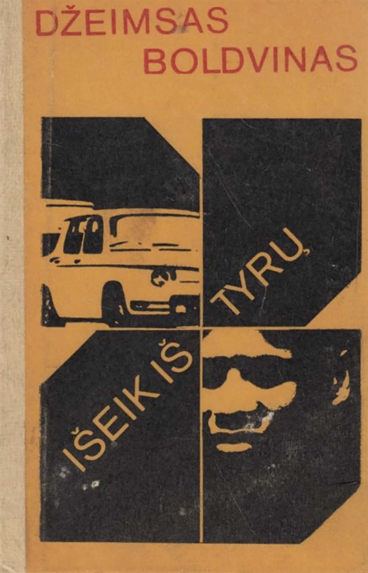
The list could continue, but the examples above already suggest a larger pattern. Copying in the Soviet context was rarely a simple imitation. It could not be because it took place within an environment defined by limited access to original sources, technological constraints, ideological censorship, and cultural isolation. Under such conditions, copying almost inevitably produced errors. Seen today, many Soviet-era copies carry a heavy feeling of melancholy. At first glance they can appear humorous or awkward – Western styles translated imperfectly, logos echoing distant originals, subcultures revived decades too late. Behind these slippages lies something more sadly revealing: a collective desire for distinction and freedom of expression within a system that offered little space for either.
In their distortions, these works also reveal the profound isolation experienced by artists, designers, and youth cultures behind the Iron Curtain. Many of the copyists must have believed they were faithfully reproducing Western culture. In reality, their versions often differed dramatically from the originals. Whether conscious or not, the act of copying itself could function as a subtle form of resistance. In a society where direct political opposition was dangerous, cultural borrowing became one of the few ways available to gesture toward another world. In the bad copy people expressed an alternative vision of everyday life – small and often ambiguous. In the gaps between imitation and misunderstanding, entirely new cultural forms emerged – forms shaped not only by Western influence, but by the peculiar conditions under which that influence was received.
The echo may have arrived late, or gone wrong. Yet even in its distortion it produced something unmistakably its own: a small, stubborn countercultural middle finger. An act of defiance and rebellion nonetheless.
References
- “About,” Echo Gone Wrong <https://echogonewrong.com/about> [accessed 19 January 2026].
- “The History of Denim,” Levi Strauss & Co. Archives <www.levistrauss.com/2019/07/04/the-history-of-denim> [accessed 10 January 2026].
- Brigita Tranavičiūtė, ‘Dreaming of the West: The Power of the Brand in Soviet Lithuania, 1960s–1980s’, Business History 62, no. 1 (2020), p. 182.
- Deima Žuklytė-Gasperaitienė, ‘Lithuanian Graphic Design in the 1960s and 1970s: Influences of Psychedelic Art’, Acta Academiae Artium Vilnensis, 103 (2021), p. 58.
- Rokas Sutkaitis, ‘Studying World Experience: Westernization of Soviet Logos 1960–1980’, IST Publishing <https://istpublishing.org/en/post/studying-world-experience-westernization-soviet-logos-19601980-rokas-sutkaitis> [accessed 10 January 2026].
- Giedrė Jankevičiūtė, ‘Antanas Kazakauskas: modernizmo standartas’ [Antanas Kazakauskas: The Standard of Modernism], in Antanas Kazakauskas: viskas užprogramuota [Antanas Kazakauskas: Everything is Programmed], ed. by Karolina Jakaitė (Vilnius: Vilniaus grafikos meno centras, 2021), pp. 45–48.