Published on
25.11.2022
Maria Muuk is a freelance graphic designer, researcher, writer and lecturer, who has a BA from the Department of Graphic Design at the Estonian Academy of Arts (2016) and an MA from the Critical Studies Department at the Sandberg Instituut in the Netherlands (2019). She started researching the local technological history of printing in late 2020, when she began creating the visuals for the exhibition ‘Art is Design is Art’ at the Kumu Art Museum.
In September 2022, together with Anna Kaarma, Eve Kask and Aadam Kaarma, she opened the exhibition ‘A Book Designer’s Studio. Jüri Kaarma and Late Soviet Graphic Design’ at the Estonian Applied Art and Design Museum, which is accompanied by a catalogue based on her research. The exhibition will stay open until 8 January 2023.
What are you surprised at? There are court offices in almost every attic; why should there not be one here? My studio also belongs to court offices, yet the court gave it at my disposal.
– Artist Titorelli
“The Trial” by Franz
An attic is a peripheral space included in almost every building – a place that is not very often paid attention to. Above us, things and lives that are put away pile up underneath our roofs: everyday artefacts, invisible proof about social habits, background knowledge, consciences, slip-ups, embarrassments. Personal archives and micro-histories that cannot be classified elsewhere. Office folders, documents, diplomas, letters, business cards, textbooks, copybooks, books, magazines. An attic is the economy, the oikos, the home and carrier of paper. Paper that carries and preserves the story of humankind. People whose job has been to put this story on paper.
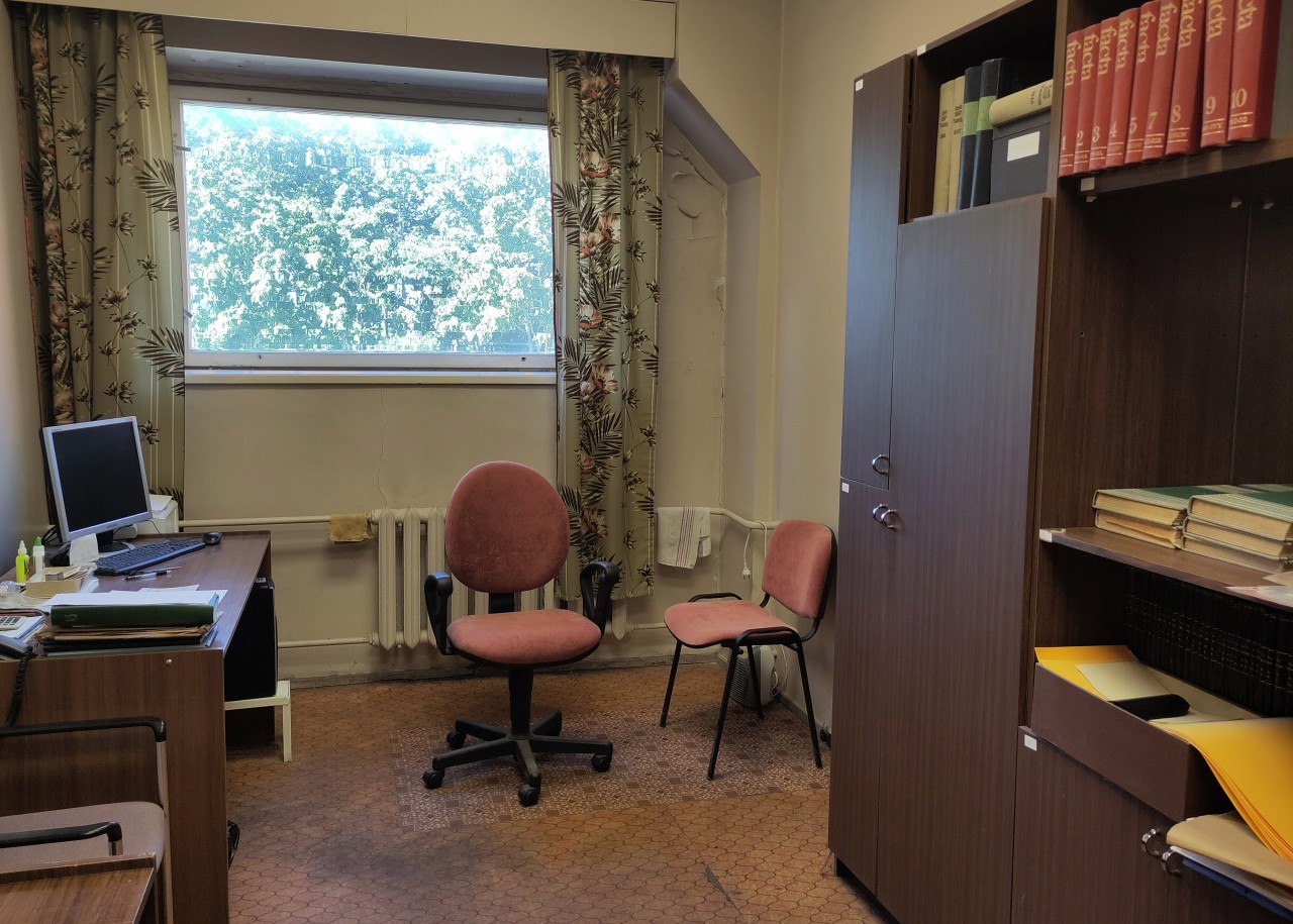
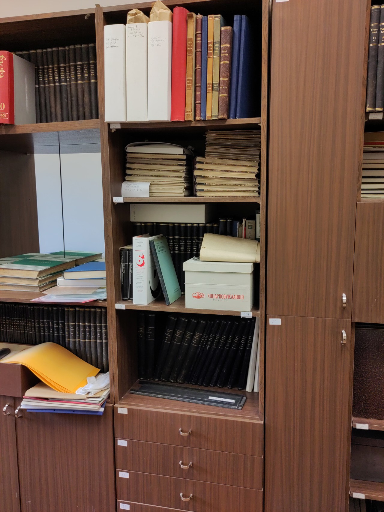
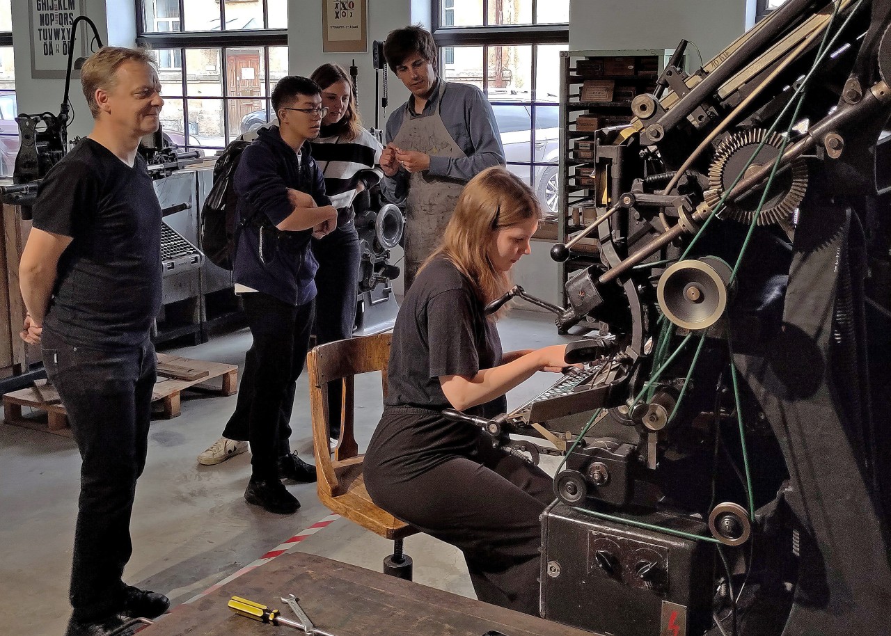
In the attic of the Tallinn Book Printers, located on Laki Street in Tallinn, there are three stuffy rooms filled with an archival collection of printing history, consisting of almost six thousand items. In the 21st century, this spectacle has been witnessed only by a few people, mainly Merike Sokka, a printing veteran who has taken care of this collection for the past few decades.
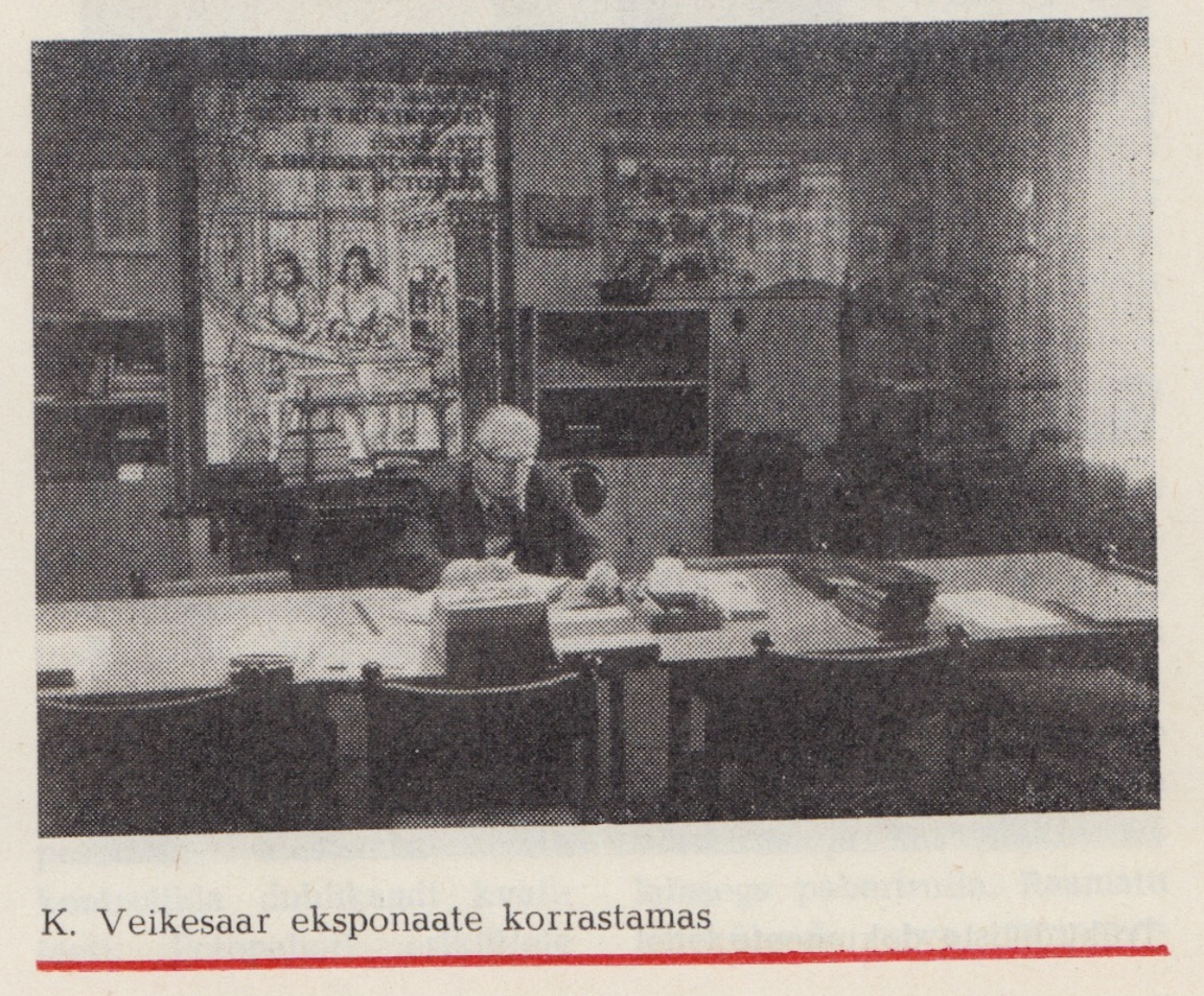
“We need a printing art museum!” declares a title in the quarterly printing industry bulletin Polügrafist in
The history of printing is equally the history of high culture as well as labour; it is located at the intersection of the technological and the intellectual. The printing house of the 17th century (like that founded by Reusner) had numerous similarities with the design studio of today: on the one hand, commissions are taken as servants of the elite; on the other hand, highly intellectual requirements are being fulfilled, including proficiency in several languages, lots of reading experience, editing skills, a sense of beauty and of enterprise. A printing worker gave form to the news and education that formed the society we are living in. Despite this important role, or perhaps because of such a state of in-betweenness and self-evidence, its history has been mostly put away, out of sight, in the attic.
In the 1990s, the collection was relocated for a time to the rooms of the Von Krahl Theatre, which had long functioned as the clubhouse of the Kommunist printing house. After that, it was taken to the upper floor of the Tallinn Book Printers’ building, first stashed away in a ventilation room and then laid out in former office spaces. The year 2033 will mark the 400th anniversary of printing in Tallinn. By that time, Tallinn Book Printers, which has so far been functioning as a cooperative, will probably be run by new business-driven owners and there won’t be space left for a printing museum.
I decide to become an attic cleaner (where should the proper, dignified home for history be?), paramedic (how can we resuscitate it?), and detective (how exactly did we get here?). I sense this to be a generational calling – for us, the future is anyway in deficit.
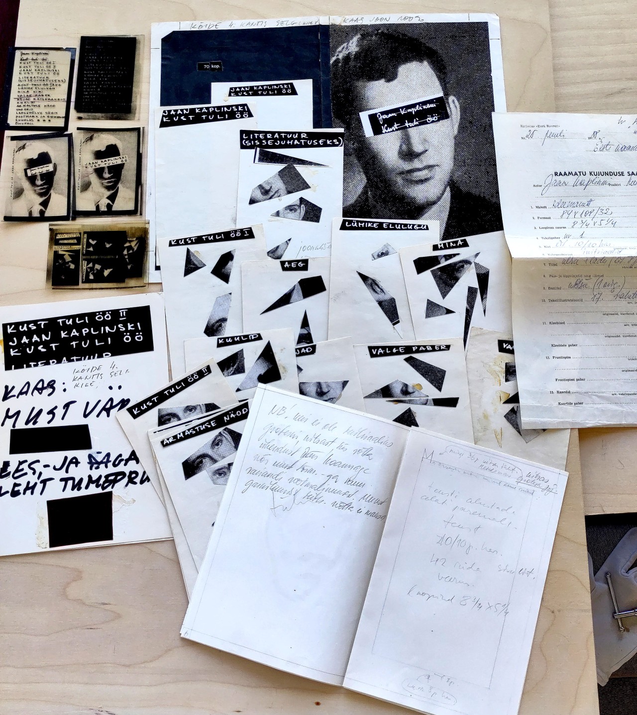
At the far end of the Lasnamäe district in Tallinn, there is an attic-studio on the uppermost floor of an apartment building in Kärber Street, where Jüri Kaarma, one of Estonia’s most prolific book designers of all time, worked since 1985. Kaarma designed thousands of literary and educational publications that are still present in Estonian society; for instance, the series Looming and Loomingu Raamatukogu, dictionaries and encyclopaedias, the magazine Vikerkaar, Avatud Eesti Raamat, art and architecture books, and collections of poetry and prose.
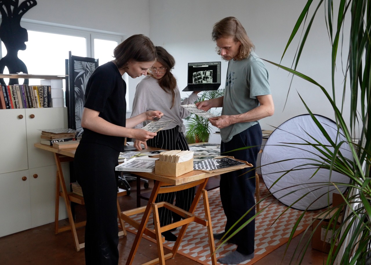
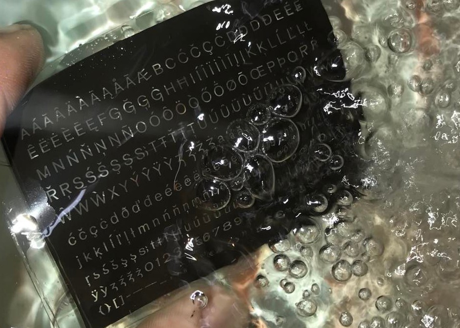
Jüri Kaarma passed away in 2011. Jüri’s wife Eve Kask (artist), daughter Anna Kaarma (artist and graphic designer) and son Aadam Kaarma (graphic designer), respectfully kept more or less everything in the workshop left behind from Jüri. Last year when I started to research the history of printing, the opportunity emerged to discover this attic-atelier. To open just one window is not enough to reanimate a personal archive:the contents of every box, envelope and data carrier must recieve fresh air as well as attention. For about half a year, we met up weekly in order to document the contents of this cacophonic design archive: microfilms used for creating the designs of book series and covers; cut-up reproductions of photo alphabets; film developing chemistry; folders containing original print files, concept mock-ups and commission forms returned from the printing house.
The descriptions I had read from printing study books and magazines materialised as clear technological examples. The other side of a manuscript sheet scribbled over with proofreading signs could be used for sketching layout templates. For the body text of a book, one could choose between ten different hot metal cast typefaces at the printing house Punane Täht. Design decisions were expressed through notes drafted in the margins of mock-ups for the technical editors and the typesetters, for instance: “NB! The drop cap should be of a condensed grotesque typeface. If there is none available, contact Jüri Kaarma or the artistic editor. Using another font is not recommended.
I feel like I’ve discovered the local material foundations of my field. I now tend to find myself more often in second-hand bookshops, where each and every publication is suddenly telling stories of impressive efforts and contributions of tens of specialists and experts to produce what we now understand as graphic design. Similarly, thanks to having become acquainted with its technological reality, I have acquired a fresh view of the design canon that I acquired at school. The futurist manifestos from the early 20th century obtain a much deeper meaning when I visualise young avant-garde artists breaking into typesetting workshops and spending illegal night hours composing and printing movable type in all the wrong ways. Or – why was manual calligraphy so hot in post-war Estonia? Since photographic techniques were not that easily accessible, the choice of fonts was extremely limited in printing houses and it was probably very complicated to push through experimental solutions in the enormous mass of staff in newly-collectivised printing conglomerates. Mastering calligraphy was the best opportunity for a graphic designer to achieve original and high-quality typography (the popularity of the calligraphy study books by Villu Toots marks the democratising influence of this technology). And, of course, the crazy photoscenographic culture posters of the 1980s a la Villu Järmut and Enn Kärmas, Ülo Emmus et al. – I still cannot fathom how creating such posters was possible without using Photoshop (and yet, history proves that the results produced in Photoshop never turned out so nicely). When I realise how much artistry was required to achieve such high quality in the context of the shortages in Soviet Estonia, these masterpieces seem to powerfully and ironically beat both the Soviet desolation as well as the Western luxuries.
Observing the history of one’s field through the lens of technology means empathising, identifying with restrictions and possibilities, co-creative criticism, and emancipation. In his book “What is a Designer”, British grand old man Norman Potter reminded students: “Don’t be conned into thinking that only new materials or processes are worth investigating. Every material available is strictly contemporary.
Through this lens, the local history of graphic design seems to be made up of friction between numerous restrictions and parties – the choreography of collectivity. Quality appears both in taking control (pushing through original ideas) and in letting go (trusting the existing structures and community). A weak spot could always be tweaked: Soviet citizens were forced to be inventors since the machinery was slow and often failing, and there were no official resources to improve the situation. The Union of Printing Industry held contests for rationalisation – a term for inventing hacks for making low-quality technology more efficient and user-friendly – in order to encourage printing workers to share their ideas with each other. Existing material was used transcontextually, if necessary. Apparently, printing ink could also be used for painting floors – perhaps the diluted grey often found in Soviet books is a sign that a smuggling-savvy printing worker’s summer cottage got a fresh look?
As a freelance designer, Jüri Kaarma also used his tools in an ‘incorrect’ way in order to make work more exciting and save time for himself. The purpose of a Letraset catalogue in its initial context in the West was to present the company’s product range to potential clients interested in their typographic sticker transfer sheets. Here, behind the gates of the free market, the menu became the bible, the lifebelt of the pirate designer that he was able to photocopy. The photographic enlarger could be used upside down as a tiny repro camera, which would save Jüri several days of waiting in line to use the professional two-room reprographic camera of the printing house of the Estonian State Art Institute. All kinds of items lying around on the table could be easily and playfully placed under the enlarger’s lens. When thoroughly contextualised, the ascetic motifs fit perfectly well to illustrate the content.
“So much can happen from a struggle to be, from the friction of being rubbed up the wrong way; […] what we cobble together out of necessity from parts at hand. How odd that from necessity we might become alive to possibility; how odd, how
*
When we started to work together with Eve, Anna and Aadam Kaarma to prepare the exhibition at the Estonian Museum of Applied Art and Design based on Jüri Kaarma’s archive and my research on printing, I invited the publishing duo Knock! Knock! Books (Else Lagerspetz and Loore Viires) to the attics of Jüri Kaarma’s studio as well as the Tallinn Book Printers, asking them for some kind of a literary interpretation of the collectivity of printing. Together we interviewed Merike Sokka, the treasurer of the printing museum, who told us of episodes, both funny and bittersweet, about the former life of a printing house. Inspired by these stories, Else and Loore created a short story/poster booklet entitled “Kirjavõlglane” (“Type Debtor”).
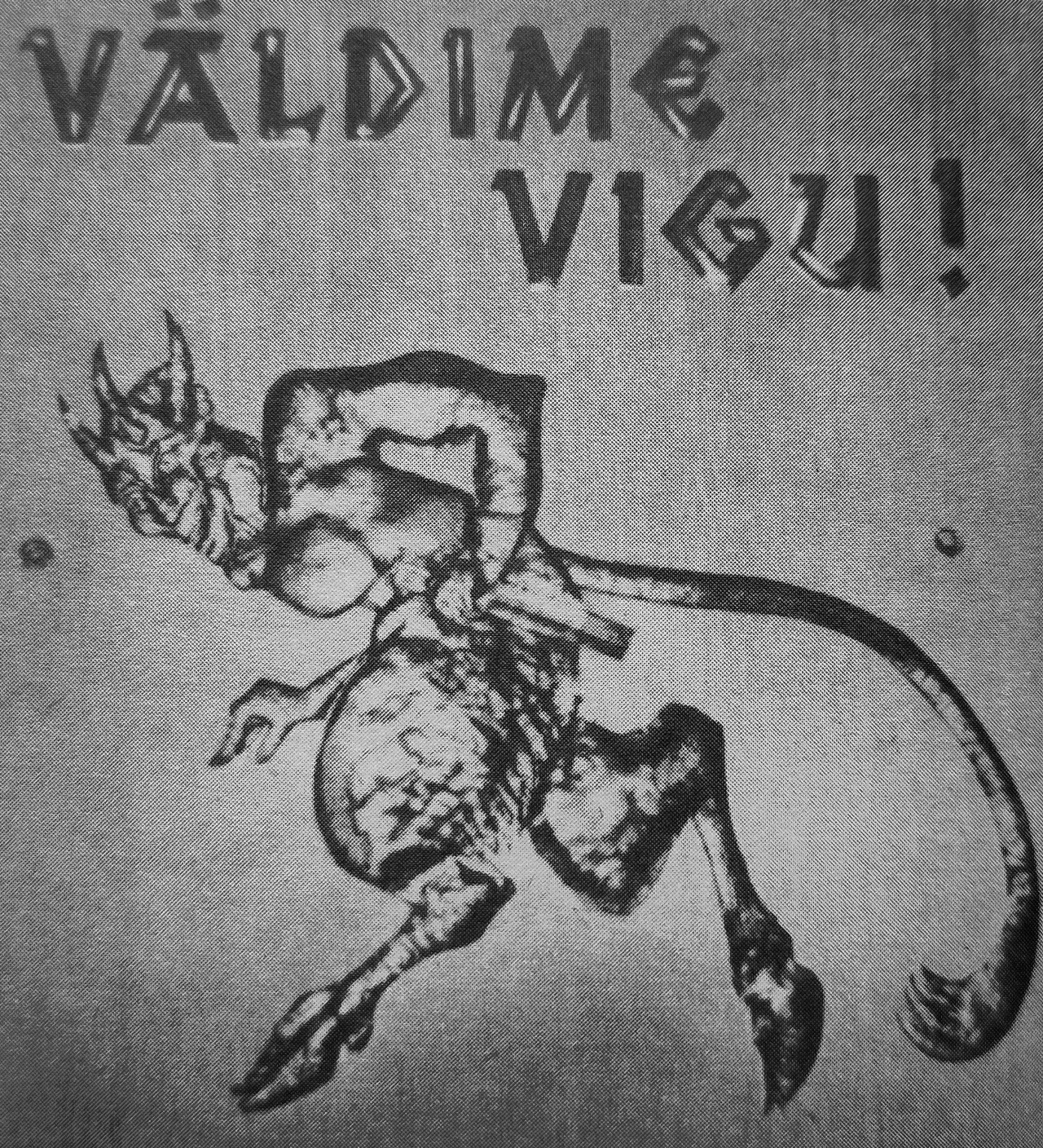
The unnamed protagonist in Merike’s stories was the primaeval permanent resident of printing houses – the printing devil. Since medieval times, this sly ghost has been blamed for every spanner in the works that interrupts the flow of the printing process: typos occurring during typesetting, which required enormous time to be fixed, incorrectly folded printed sheets, material or ink that ran out half-way through the print run. But as the short story concludes, there is nothing supernatural about these errors – these challenges are nothing but proof of the unreliability of Soviet technology as well as the people who were struggling to be and to create in a world that does not accommodate them.
Some devil’s droppings can also be found in “Type Debtor”. We became acquainted with the capricious line casting machine in the TYPA Printing and Paper Art Centre in Tartu since we decided with Else and Loore to use this machine, as well as hand composition, for typesetting parts of the story. Technician Jörgen Loot had to tinker with this Soviet monster from the 1970s almost every time it spat out another metal cast line of letters. Matrices of a 10-point font had somehow slipped into the 12-point set of the typeface we were using. From our side, we contributed with typos that could be discovered only on the galley proof printed after hours of typesetting and battling with the machine. May these ‘errors’ left in the final publication serve as a homage to the complexity of collaborative events and the dedication of previous generations.
In fact, we, the attic cleaners, have an unprecedented opportunity to queer to the maximum. We have a total overabundance of quality! It’s so awfully comfortable and boring how pure and ventilated our rooms are thanks to all the robotic vacuum cleaners and air purifiers. Thanks to the fact that now everything is more or less automatically beautiful, the new generation has a privilege – or perhaps even a duty – to blow the dust off the technologies of our predecessors and to use them as correctly or incorrectly as possible, while treating pre-existing beauty standards as just one among many.
“To queer use is to linger on the material qualities of that which you are supposed to pass over; it is to recover a potential from materials that have been left behind, all the things you can do with paper if you refuse the instructions. That recovery can be dangerous. The creativity of queer use becomes an act of destruction, whether intended or not.“ “Queer use in other words, can be understood as vandalism: ‘the willful destruction of what is venerable and
In this spirit, type designer Aimur Takk, who we asked to develop fonts for our exhibition materials, put contemporary habits of designing type to the test. He spent a week in the darkroom of the Estonian Academy of Arts while performing photo-surgical experiments with his own digitally created font Aktsidents.Type design currently means working on a large bright screen, positioning angles and anchor points within a black-and-white vector network with mathematical precision. In a darkroom, one’s eyes have to adjust: images on the films are tiny, zoomed out; focusing the edges to be sharp is a matter of luck; the edges and corners are foggy; intersections form shy ligatures. The shadow underneath a letter in negative gives it a bold weight, whereas holding it aslant creates an unusual cursive shape. Aimur’s experiments (some of which can be seen at the exhibition) did not by far exhaust the possibilities of analogue photography as a technology for designing type; yet, they offer material for digital synthesis and contemporary contextualisation potentially for years.
The typographer of former times was kept busy enough to achieve the smoothness, clarity and crispness, which we now have no way back from. As the successors of this field, we owe him the pleasure of the incorrect, nonsensical, weird use of his tools, while fighting our personal existential battles with technological barriers.
To conclude, a reminder, which Eve Kask often uses to illustrate Jüri Kaarma’s working methods: “Underneath the enlarger, even dust may become something.”
References
- Originally published in 1925 in German (“Der Process”) by Verlag Die Schmiede, Berlin. Quoted in Estonian from: F. Kafka “Ameerika. Protsess. Loss”, p 322. Tallinn: Eesti Raamat, 1987. Translated into Estonian by August Sang and Mati Sirkel. Editor Lembe Hiedel. Designed by Jüri Kaarma. Artistic editor Maarja Vannas-Raid. Technical editor Asta Krebstein. Correctors Ü. Kiivet and K. Suisalu. Given over for typesetting 16.02.1987 (printing house Punane Täht, Pikk St 58, Tallinn). Given over for printing 19.09.1987 (Hans Heidemann printing house, Ülikooli 17/19, Tartu). Format 60x88/16. Printed on book and magazine paper. Typeface: Zhurnalnaya. Offset printed. No of printing plates: 41,0. Copy run: 32 000.
- Trivimi Velliste, ‘Vajame trükikunstimuuseumi’, Polügrafist No. 2 (1984).
- Jüri Kaarma’s concept mock-up for prose collection “Kust tuli öö” by Jaan Kaplinski, (Tallinn: Eesti Raamat, 1990).
- Norman Potter, What is a designer: things. places. messages (London: Hyphen Press, 1969/2002), p. 153. // My gratitude to Oliver Long who emphasised this quote in his essay ‘Not Giving Up the Ghost’ included in the collection All Horses Are the Same Colour (Tallinn: EKA GD MA, 2022).
- Norman Potter, p.12.
- Sara Ahmed, ‘Queer Use’, <https://feministkilljoys.com/2018/11/08/queer-use>.
- Ibid.
- Ibid.