Published on
30.06.2023
Pierre Benoit is a Swiss-Japanese graphic designer currently studying at the graphic design MA programme of the Estonian Academy of Arts. He graduated with a BA in graphic design from ECAL/University of Art and Design Lausanne in 2012 before working for various graphic design studios in Europe and the US. He founded his own studio in 2017, where he operates within the fields of art, design, architecture and education on both commissioned and collaborative projects. His current interest focuses on the topics of interculturalism, field research, artisanship and market displays.
Wolfgang Weingart (1941–2021) was one of the most notorious Swiss graphic designers from the twentieth century. By the time he started his professional and teaching career as a graphic designer in the late 1960s, after graduating from the Merz Academy, Stuttgart, and later the Schule für Gestaltung, Basel, the Helvetic design scene had been hegemonized by the International Typographic Style for the previous two decades. This style is a prime example of the modernist values of process, production and outcome applied in the field of graphic design. The Swiss scene became known globally for exporting this specific approach to design and aesthetics, with the most famous example perhaps being the release of the typeface Neue Haas Grotesk, also known as Helvetica, by Max Miedinger in 1957.
In 1968, Weingart started teaching at the School of Design in Basel, which was the base for heavyweight designers Emil Ruder, Armin Hoffmann and Karl Gerstner (GGK) among others. But unlike his colleagues, Weingart stated the following: ‘When I began teaching in 1968, classical, so-called Swiss typography (dating from the 1950s), was still commonly practised by designers throughout Switzerland and at our school. Its conservative design dogma and strict limitations stifled my playful, inquisitive, experimental temperament and I reacted strongly against it.
More recently, Jonas Voegeli of Hubertus Design – or even more obviously – his ex-work partner Ludovic Balland, a direct student of Weingart, are good examples of the Swiss post-modernist legacy that directly descends from him. In the French newspaper Libération in 2017, Balland described his role as a graphic designer: ‘We are coming back to the idea that signature (design) doesn’t exist anymore, but it is an aberration. If modernists have produced anonymous graphic designers, it was for industrial reasons, linked to the invention of pre-fabrication, the grid-based and the modular systems. Nowadays, there is no use of being anonymous, the modernist approach merely became a matter of style (to do so).
His statement still pinpoints the duelling reality of Swiss graphic design identity. I myself have been assigned, while attempting to create a web design identity for an American fashion magazine when working in a well-established studio in New York City, to stop any experimentation and simply produce ‘some very Swiss, crisp and clean international looking design’. The legacy of Swiss Style still has a strong hold on design inside and outside of Switzerland, although the post-modern discourse of Weingart had opened up a whole new field of possibilities amongst practitioners in the country.
If some studios or individuals have been openly criticising any form of comeback of the pre-postmodernist times, then others have embraced the systematic methodology of modernism. For instance, the prominent design bureau NORM based in Zurich has taken it a step further by incorporating technological parameters coming from the advent of the digital age that has transformed the job since the 1990s. Just as the name of their practice suggests, the whole design process of the studio run by Dimitri Bruni, Manuel Krebs and Ludovic Varone is based on a set of rules that they have generated. The typeface sizes, book formats, grids and any design elements are all determined by their own guidebook, made of pages of tables filled with ratio-based numbers that they can directly apply to their work. The algorithm they have created and the surgical outcome it generated, applied using a couple of typefaces developed in-house that are used for all of their projects, became the very distinguishable signature of their production.
But there might actually be a bit more to the graphic panorama of Swiss design than the opposing principles of simple modernist versus post-modernist. A new theory called metamodernism emerged at the end of the 90s and was published in 2010 by cultural theorists Timotheus Vermeulen and Robin van den Akker. Luke Turner, a British artist and writer, has defined this new concept on the website Notes on Metamodernism, founded by the two Dutch theorists, with the following words:
Whereas postmodernism was characterized by deconstruction, irony, pastiche, relativism, nihilism, and the rejection of grand narratives (to caricature it somewhat), the discourse surrounding metamodernism engages with the resurgence of sincerity, hope, romanticism, affect, and the potential for grand narratives and universal truths, whilst not forfeiting all that we’ve learnt from postmodernism. Thus, rather than simply signalling a return to naïve modernist ideological positions, metamodernism considers that our era is characterised by an oscillation between aspects of both modernism and
Unlike the two previous clashing philosophies that defined the design course of the twentieth century, metamodernism could be considered an extensive and rejoining sequel of the two, where one can finally embrace the assets of both ideologies. The design duo Maximage and their motto Emotions & Technology is perhaps a good example of metamodernism in the context of Swiss graphic design.
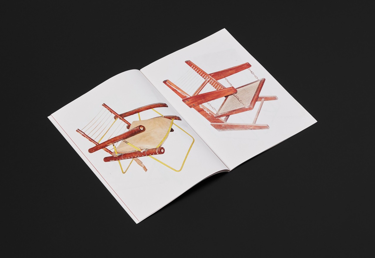
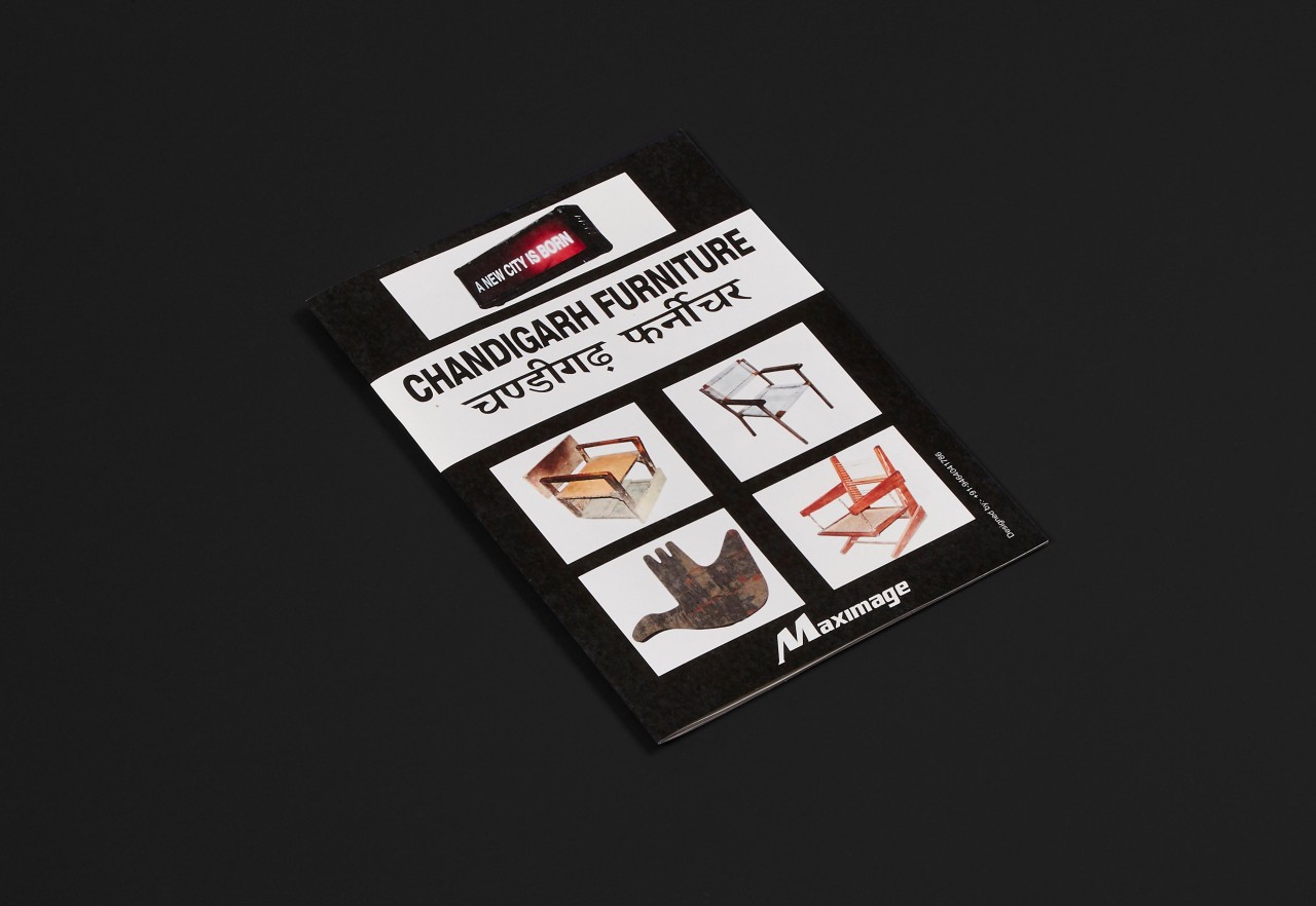
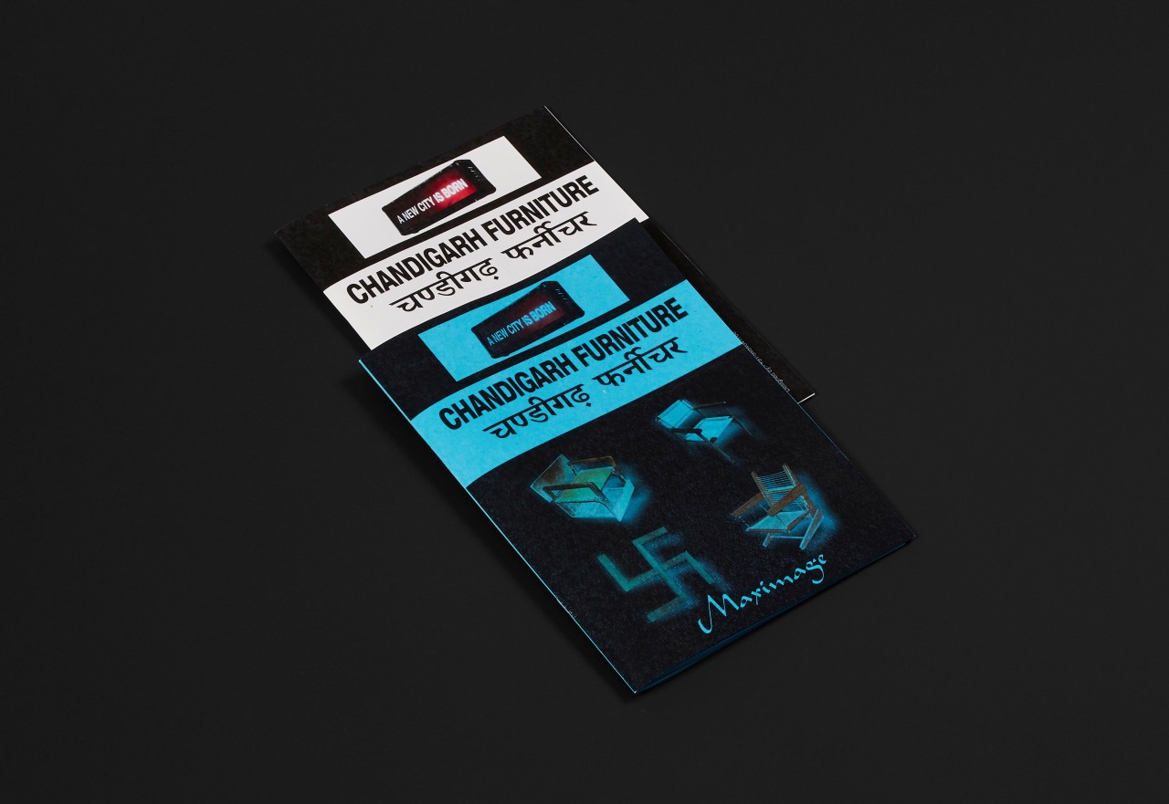
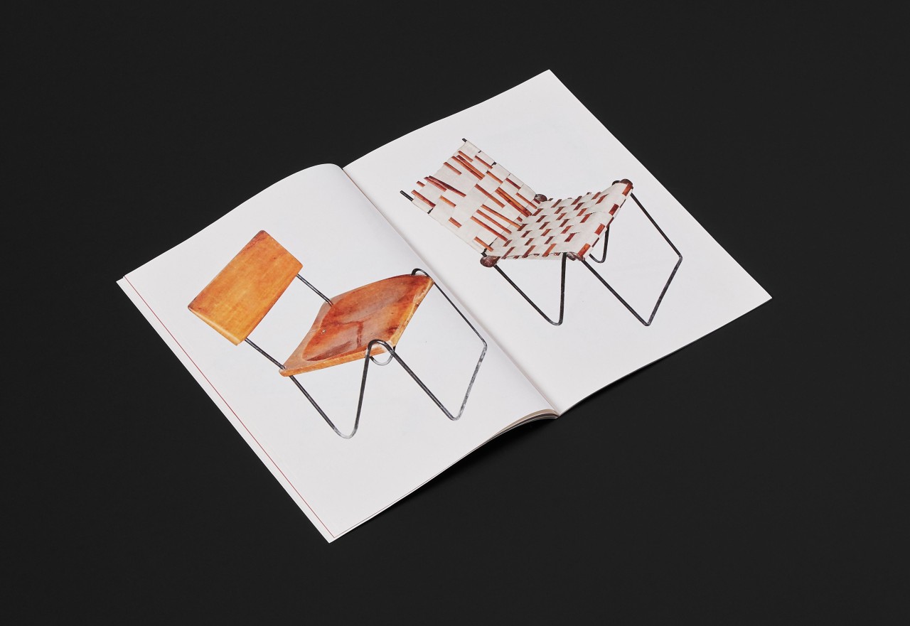
Based in Paris and Geneva, the Maximage studio has been exploring functional and simple design in the most traditional sense of Swiss modernism, but with an experimental methodology in the printing techniques that allowed them to investigate their sensitivity and led to a certain amount of happy accidents that became their visual trademark. Many of their projects, including books and posters (e.g. Raphael Hefti’s Salutary-Failures), although looking very simple and mass-produced at first, are manufactured in a way that guarantees one-off results. By creating their own means of production, or by hacking printing technology, they post-modernised the very modernist style of their work and built a new territory where they were able to create their own language. Speaking of territory, one of the two founders David Keshavjee has also been examining his relationship with his father’s country of origin, India. In the catalogue called Chandigarh Furniture (Villette Edition, 2014), he collects and features a number of furniture pieces (chairs, tables and more) designed by Swiss modernist architect Le Corbusier that are transformed and refurbished by the locals of the utopian city in India for their own practical purposes. From there, he asked an Indian company to cut out all the images. He edited these pictures in the form of a book and printed them in a facility located in the Swiss mountains, on Indian paper, and asked a studio in India to design the cover for the publication. By doing so, the designer’s work process encapsulates the cultural concerns and consequences of the globalised world we have inherited from the twentieth century’s expansive politics and economy, and tries to find new ways to respond to it.

The global crisis we’re currently facing – from environmental emergency to deep rooted socio-political injustices and dominative power dynamics – could not be responded to through the polarising prism of (post)modernism anymore. The objective model of modernism – that once fitted so well the neutral political view and culture of Switzerland – is not applicable for any individual that has developed a critical self-consciousness of their role. Weingart’s legacy of postmodernism also appears to be too self-centred and individualistic in a society that needs collaborative efforts to be reinvented in order to survive. Metamodernism has emerged from a generation of designers that needed a new multiplex, conscious and yet hopeful frame of reference. Just like any other institutions, our ideologies of practice need to be constantly questioned. ‘Institutions are shaped by a series of actions and processes, and their repetition. I think it’s important to confront institutions with their habits, routines, procedures, strategies, conventions, roles or organizational forms,
References
- Wolfgang Weingart, My Typography Instruction at the Basel School of Design/Switzerland 1968 to 1985, Design Quarterly 130, (Walker Art Center, 1985).
- Elisabeth Franck-Dumas, (2017), <https://www.liberation.fr/images/2017/02/17/ludovic-balland-roi-du-print_1549220/>
- Luke Turner, (2015), <http://www.metamodernism.com/2015/01/12/metamodernism-a-brief-introduction/>
- Piper Marshall, (N.D.) <https://curamagazine.com/digital/25-questions-with-ramaya-tegegne/>